
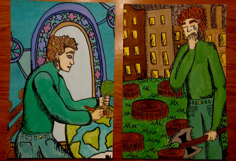
Artwork: Illustration (Positive and Negative)

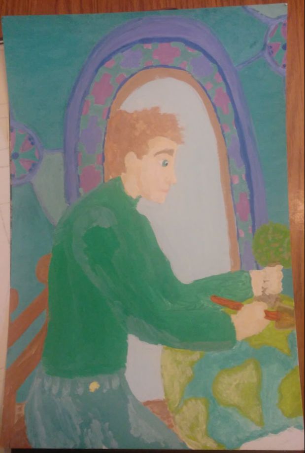
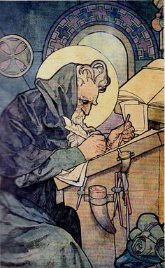
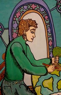
"I can do it"
|
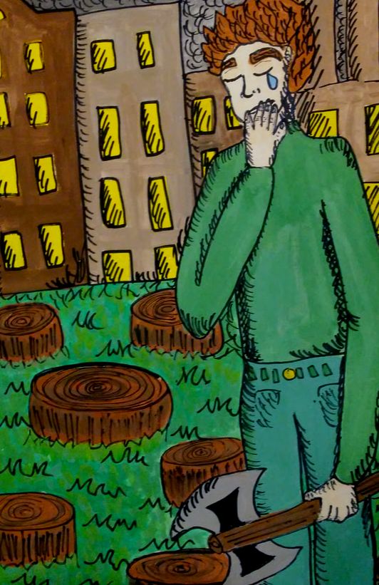
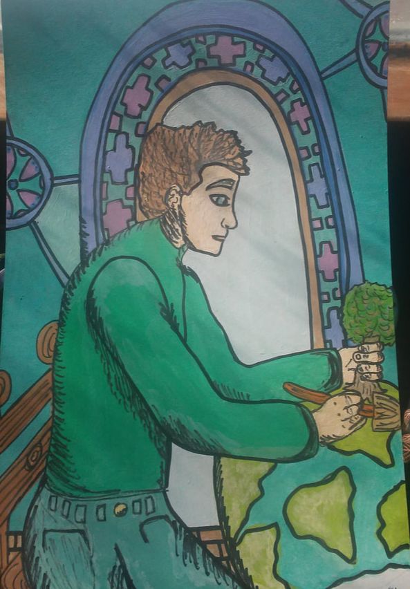
"What have I done?"
|
Title: "I can do it" and "What have I done?"
Size: 25 cm x 38 cm (both pieces are the same size) Medium: Watercolor and ink marker on illustration board Completion: January 25, 2019 |
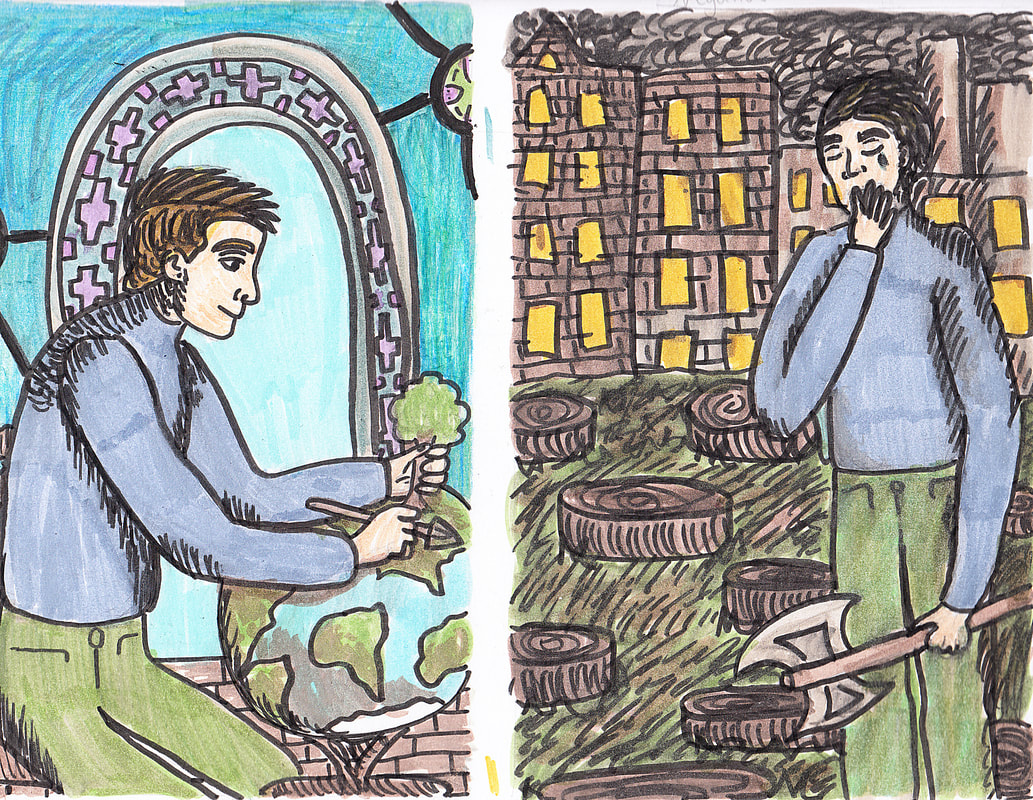
"I can do it" and "What have I done?" is an illustration done on an illustration board using watercolor and ink markers that is inspired by the watercolor study, Writing Methodius and Philosopher Cyril, done by Alphonse Mucha. "I can do it" and "What have I done?" are a series focusing on the treatment of the environment and how it should be taken care of versus how it is currently being treated by humans.
Inspiration
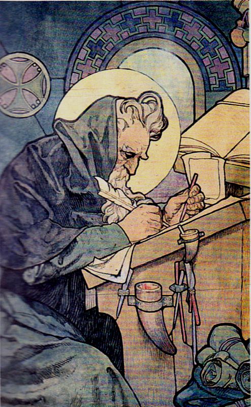
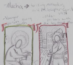
Alphonse Mucha. Writing Methodius, 1931. Pencil, ink and watercolor on paper. Print.
|
I was struggling at first to find an inspiration for my illustration piece until I tried to comprehend how positive negative fit into the interests and aspects of my life. I decided to focus on my love for the environment and how I believed that it should be taken care of more. While doing research for my self portrait I came across Writing Methodius and Philosopher Cyril by Alphonse Mucha. I loved the concept of using the beauty of the Art Nouveau movement to depict a serious issue in our society. I liked how even though the dark outlines and hues were simple, the pieces still had a great sense of unity as separate pieces and as a series.
I decided to use the same poses as the figures in my pieces and similar colors to maintain a sense of balance and unity within my pieces as well. I also wanted to keep the background from the Writing Methodius piece. |
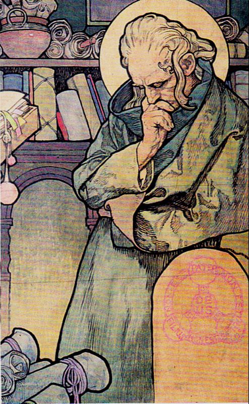
Alphonse Mucha. Philosopher Cyril, 1931. Pencil, ink and watercolor on paper. Print.
|
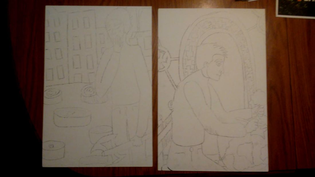
Planning
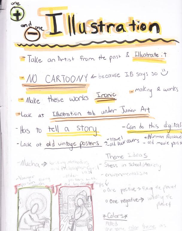
This is one of my sketchbook pages in which I wrote down some of my ideas and thoughts for the pieces before I began my sketches.
|
In my illustrations I decided to depict my feelings about how the Earth is being treated and how I believe that we never really will know what we had until it is gone and we realize our mistakes. To the right are my planning sketches. In the first set of sketches I sketched out the overall shapes that the pieces would contain just to help plan the placement of the figures. The second set of sketches were my final planning sketches that I did for the pieces. In these sketches I played with color and added more details. I also tested to use of thick, dark lines in order to emphasize the different aspects of the pieces that were similar colors to one another. I didn't have enough colors that were the right hues to be similar to my inspirations so later on I had to experiment more with color. I planned on using deforestation as the main point in my illustrations because it is one of the most relevant and growing problems that everyday people know about.
|
These were my original planning sketches to figure out balance and shapes.
These were my final planning sketches. In these I played with color and added more detail to the original sketches that I did.
|
Experimentation
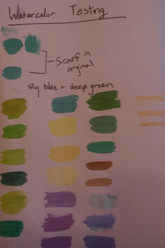
Testing the colors was hard at first. I have never mixed watercolors before so I had to test what color what they would dry as before I actually used them.
|
One of the biggest experimentation that I did in this piece was the use of color and watercolor in general. I have always found watercolor to be a difficult medium for myself but I decided to try out watercolor tubes since I am comfortable when working with traditional illustration mediums such as colored pencil
|
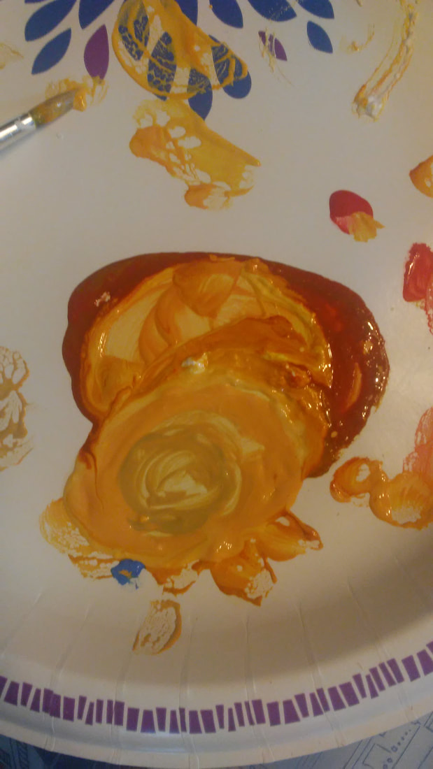
Skin coloring was another thing I had to go back and rework many times (the dark to the light). It took several tries to get a working skin color.
|
Another experimentation I did was the mixing of skin color. It too me a while to get the right color and I was still unsure of how they would look as they dried. I found that it seemed to dry a lot lighter than it looked before it had dried, especially if it had more water in it than the other paints.
|
After I finished using watercolor I was worried because it didn't look good to me.
|
I also experimented with how the piece looked with dark outlines on the pieces and found that it helped with the overall unity of the piece and created a more appealing image with the lines.
|
I felt a lot better about my piece once I added the dark outlines to it because it helped add to the overall unity of the piece.
|
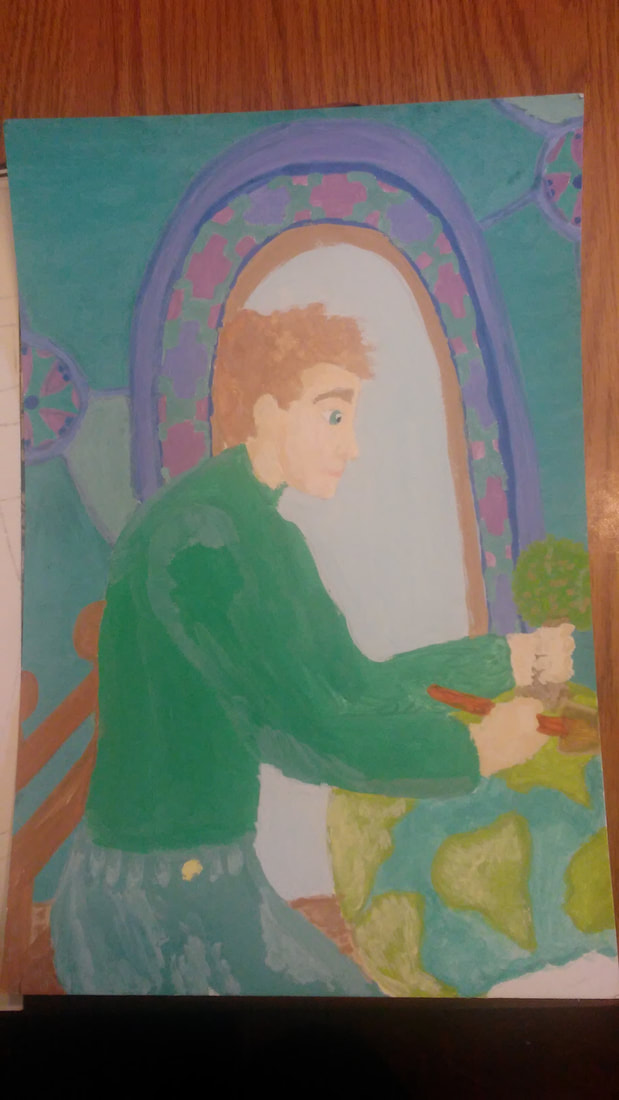
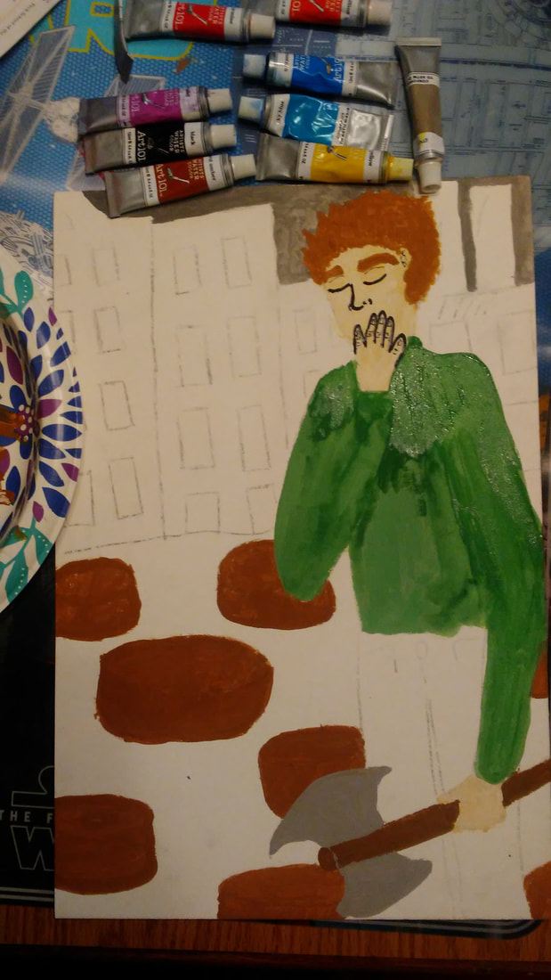
Process
|
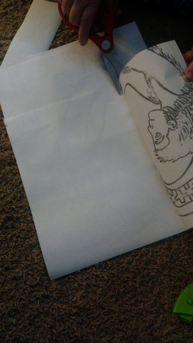
To start out, I scanned the original final planning sketches that I did in black and white and printed them out. Because the illustration board was larger than a standard piece of paper that my printer could print, I printed out a couple sheets and taped them together to form to one image in the size of the illustration board. I began with the positive illustration, "I can do it".
|
|
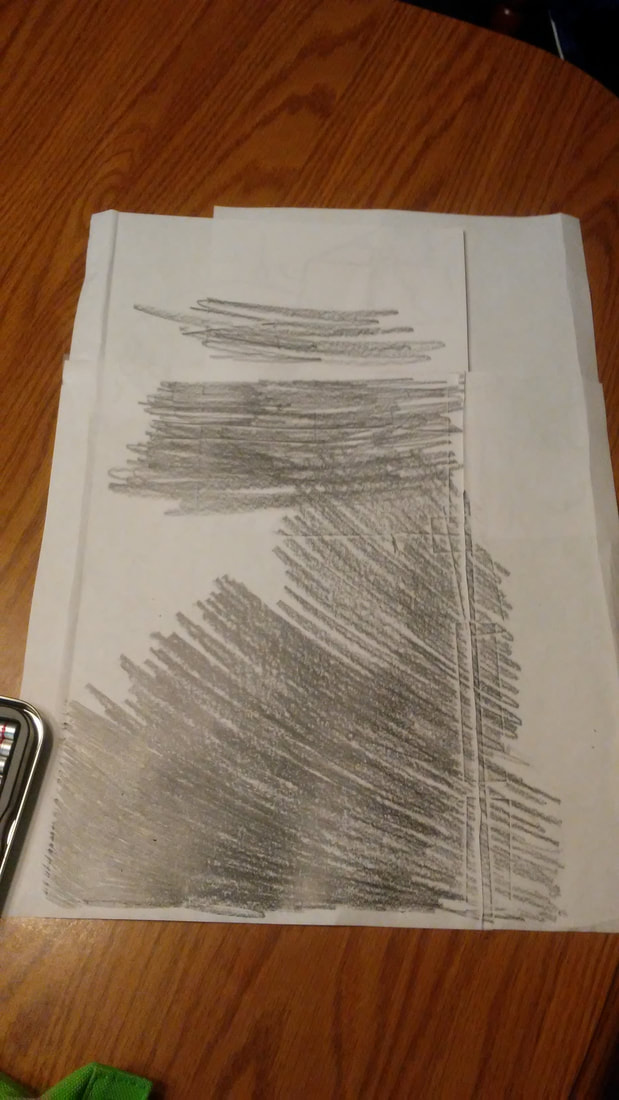
I decided to do the transfer method using the image I printed out because I found it difficult to create a good image when sketching by hand because of the finger sprain that I got while playing basketball. Once the printed image was taped together I used a graphite pencil to draw on the back as shown in the image on the left.
|
|
Then, I taped the printed image over the illustration board and traced major lines on the top of the printed image so that the image would transfer to the illustration board. Once the first one was finished, I traced and transferred the second board image.
|
|
After both illustration boards had the images sketched onto them, I began the watercolor process. The watercolors I used were Art 101 tube paints. For the shirt in the image on the left I mixed the colors deep green, sky blue and a little bit of white with water, for the background I mixed the deep green and white with ultramarine blue instead. I found that to get this illustration to look similar to my inspirations it required a lot of using the white watercolor or water to lighten or thin out the paint as it was applied.
|
|
For the second illustration I used similar colors made with the ultramarine and sky blues, deep green and chrome green and white. For the majority of the rest of the illustration I wanted to give it a gloomier feeling so I did not use white as much for the rest of the illustration. Instead, I relied on the grey, burnt umber, and black for the background and foreground.
|
|
Once both of the illustration boards were completely dry I started to create dark, thick lines as outlines around the parts of the piece and as the shadows. I decided to do these outlines like Mucha did in order to help the parts of the piece that were similar colors to stand out from one another and add more depth to the piece overall.
|
Reflection
Compare & Contrast
|
Alphonse Mucha's Pieces
|
|


Similarities |
Differences |
|
|
Critique
I personally like the first of my pieces "I can do it" more than I like the other one, "What have I done?", but I think they turned out fairly well (especially since I did it with my sprained finger). They effectively convey the message that I wanted to achieve in them and work well together as a series. The watercolor was a bit challenging for me, but for my first time using them from the tube I am happy with how the pieces turned out. If I were to redo my illustrations, I might have tried a different medium such as my Faber-Castell markers or a brush-like paint marker. I was also interested in trying gouache or watercolor pencils instead of watercolor tubes next time. If I had more time to work on the pieces I also would have added more details to the piece to eliminate the excess empty space left on the wall or buildings in the pieces.
ACT
|
Clearly explain how you are able to identify the cause effect relationship between your inspiration and its effect on your artwork?
The use of color and dark, black lines to create emphasis and unity in Writing Methodius and Philosopher Cyril inspired me in the way that I emphasized the human figures while still created unity in my pieces. What is the overall approach the author has regarding the topic of your inspiration? Sarah Gibbens believes that deforestation is a problem but when fixed it can help the Earth and certain areas to continue to flourish again like they did before the problem started. What kind of generalizations and conclusions have you discovered about people, ideas, culture, etc. while you researched your inspiration? I concluded that sometimes humans as a whole tend to ignore major problems until they are right in front of us and demand some kind of attention right away. What is the central idea or theme around your inspirational research?. The central theme to my research for my inspiration was the concept of deforestation and how it will continue to grow as a problem if not taken care of right away. What kind of inferences did you make while reading your research? I inferred that like Mucha and his more cultural pieces, art can have a message that the public can understand when referring to an everyday problem that they believe needs to be taken care of. |
BibliographyButler, Rhett A. “Researchers Create Global Map of World's Forests circa 1990.” Conservation News, Conservation News, 14 Oct. 2014, news.mongabay.com/2014/10/researchers-create-global-map-of-worlds-forests-circa-1990/.
“51 Breathtaking Facts About Deforestation.” Conserve Energy Future, 27 Dec. 2017, www.conserve-energy-future.com/various-deforestation-facts.php. Gibbens, Sarah. “This Island Was on the Brink of Disaster. Then, They Planted Thousands of Trees.” National Geographic, National Geographic, 19 Dec. 2018, www.nationalgeographic.com/environment/2018/12/pemba-kokota-tanzania-islands-reforest-and-adapt-to-climate-change/. Sato, Tomoko. Mucha. Taschen, 2015. |
