
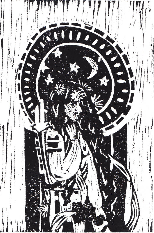
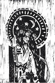
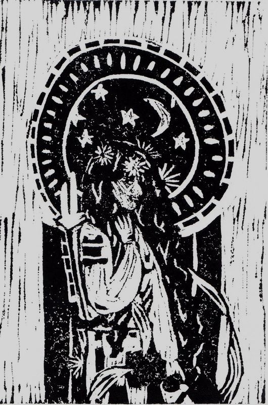
Artwork: Block Print
|
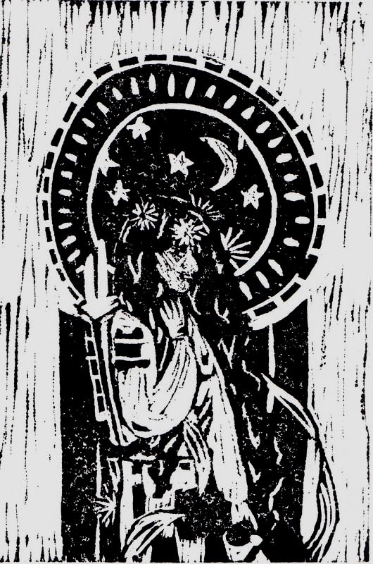
Title: " To Infinity and Beyond"
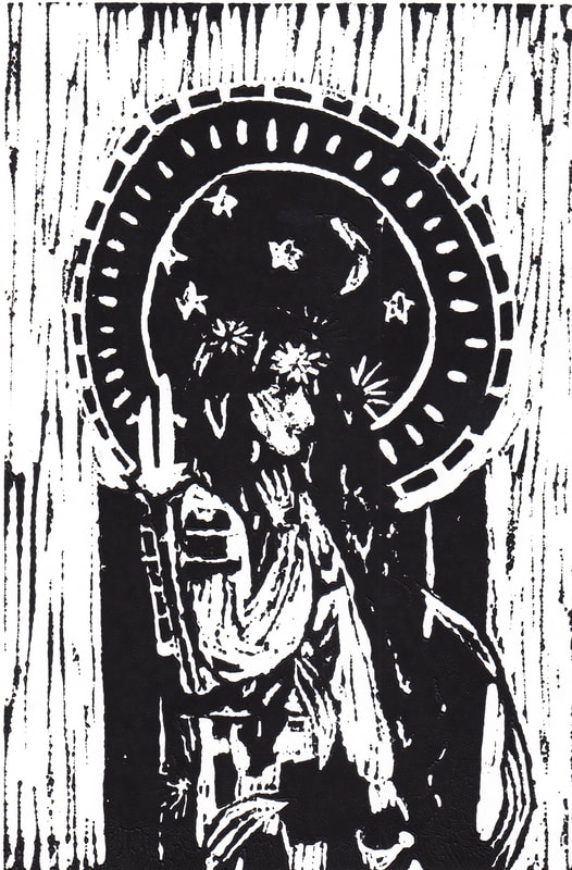
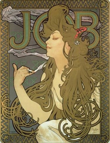
Size: 23 cm x 30.5 cm Medium: Block Print on drawing paper Completion: February 27th, 2019 "To Infinity and Beyond" is a block print on drawing paper made using water-based block printing ink. This piece was inspired by the ideals of beauty and women in Alphonse Mucha's Pieces Job, and Moet & Chandon: Dry Imperial and Norman Rockwell's Girl at Mirror. To Infinity and Beyond depicts a feminine woman dressed in an astronaut's gear to challenge the ideas in society that a woman can be masculine or feminine but not both.
|
Inspiration
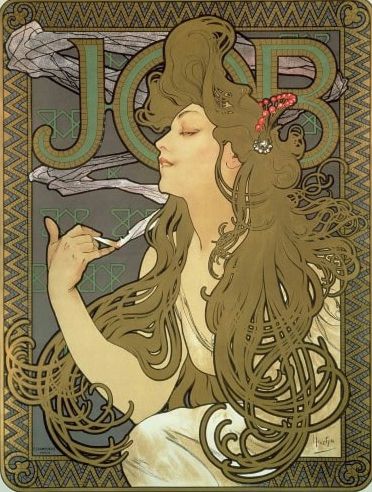
Mucha, Alphonse. Job, 1896. Color lithograph. Muchafoundation.org

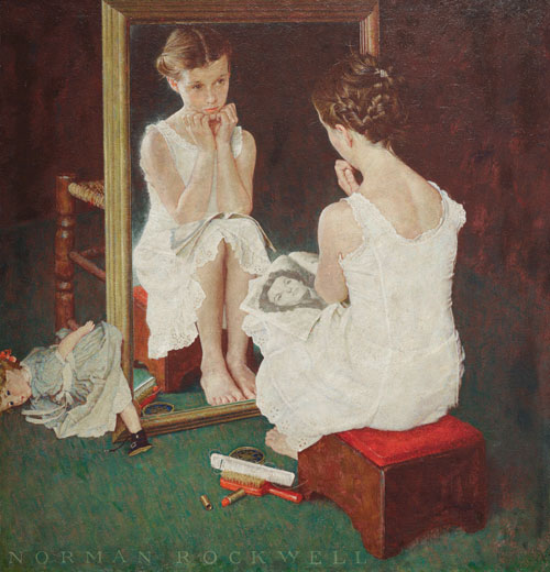
Rockwell, Norman. Girl at Mirror, 1954. Oil on canvas. Norman Rockwell Museum.
|
For my block print, I was inspired by the style of Mucha and Art Nouveau. The art styles depict beautiful women, even if they were more objectifying than revolutionary. I wanted to take the beautiful idea of a "new woman" and mix it with the meaning of Girl at Mirror by Norman Rockwell. In his piece, Rockwell's image of the young girl caught up in her appearance, trying to be like the image in the magazine instead of the young girl that she really is. I took my own ideas of what a woman should be like and put it against societies ideas for women, like Rockwell and Mucha did. I also wanted to take the beautiful use of geometric versus organic shapes that Mucha utilizes in his works.
I wanted to challenge the ideas that a woman was either feminine or masculine and if she did things that made her one, she could not be the other. As a girl who wants to go into a STEM field, I think it important to normalize women being in positions that are mainly male dominated, but not without ripping them from their option to be feminine. Phrases like "Oh, you clean up well even though you do ____" or "You didn't strike me as the type of person to do that job" are some of the many ways that women are put down for choosing to do masculine or feminine things even though they mainly stick to one type. |

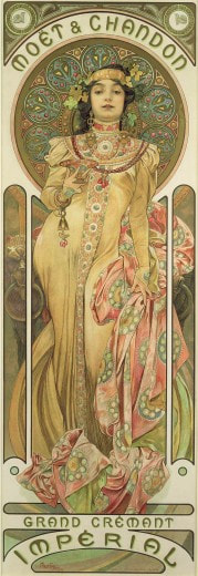
Mucha, Alphonse. Moët & Chandon: Dry Imperial, 1899. Color lithograph. Muchafoundation.org
|
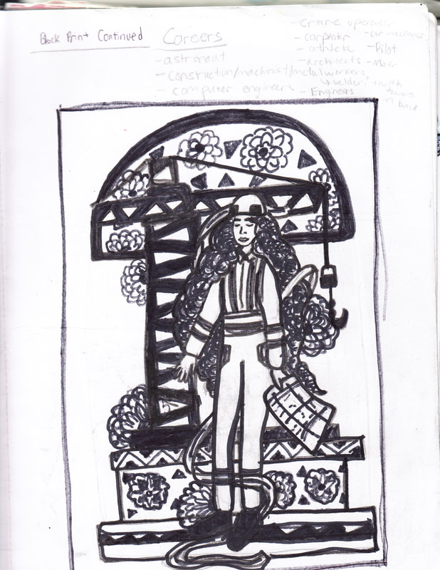
Planning
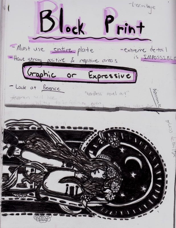
This is an image of my initial planning page and ideas.
|
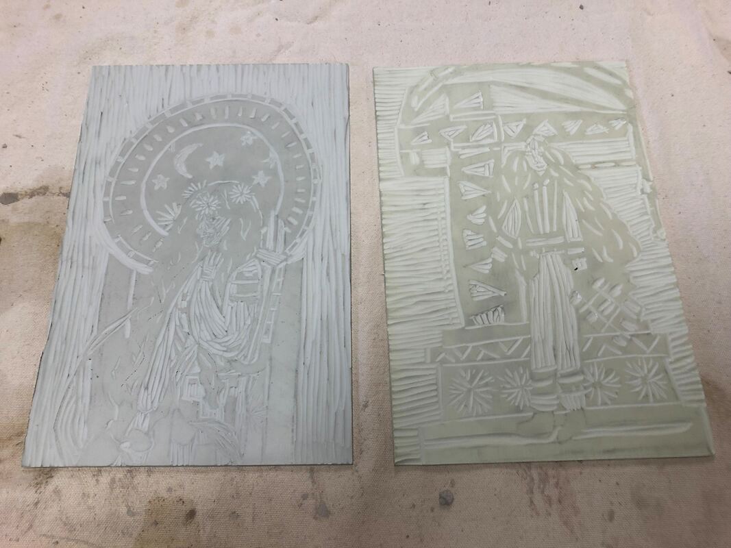
When I began planning I knew I wanted to depict women from masculine-dominated jobs in feminine, Mucha-style ways, but it took me a while to find careers that I wanted to depict the most since there are so many jobs out there that are severely lacking in women. I decided finally in my sketches to do one with a woman astronaut and another option with a woman construction worker instead. I wanted to do both but eventually I decided to go with the sketch I did for the woman astronaut because as a woman of science, I connected more with the career itself and decided that I liked my use of organic and geometric shapes for the background and foreground of the piece. I decided against the idea of the construction worker woman because I felt as though it had a lot of little details I would need to worry about and that there wouldn't be a similar amount of organic shapes mixed in with the geometric shapes that were prevalent heavily in the sketch.
|
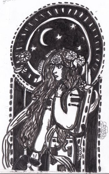
This was the initial sketch that I made for the block print. (click to enlarge)
This was the other idea that I had for my block print. (click to enlarge)
|
Experimentation
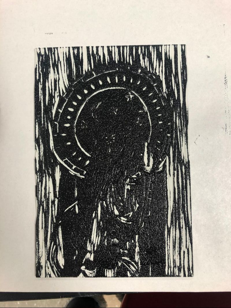
This print was one of my first ones and one of my favorites with how the details turned out, but because of the spotting in the ink on the lower half of the print, I decided to do more.
|
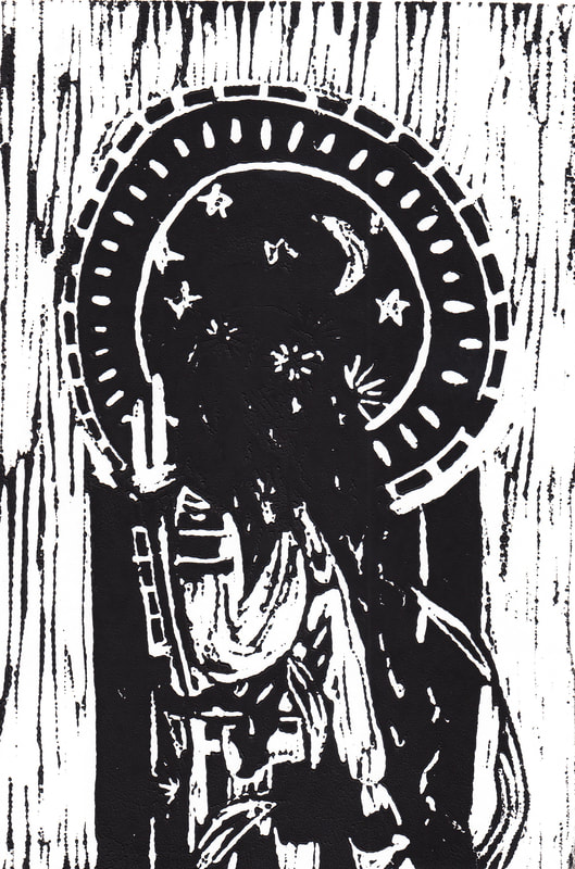
Because I was afraid of the spotting happening again, I added more ink, but I added too much ink to the area with the head of the woman.
|
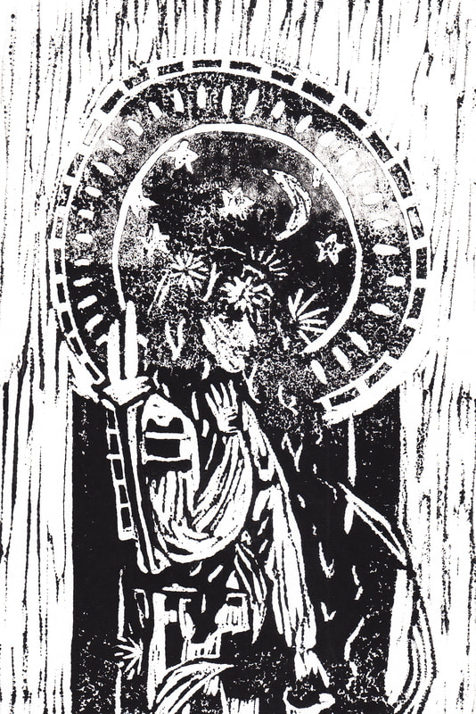
After I added too much ink last time, I ended up adding too little this time instead, which lead to more spotting in the upper half of the print.
|

This print turned out better than the last two but it was still too dark to be able to see some details fully.
|
This was my second best print. While it turned out cleaner than the first one I did, I still wanted more details shown in the head areas with the flowers.
|
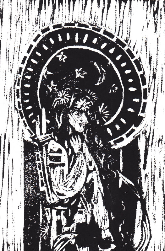
This was another decent print, but I didn't like how some of the speckling was centralized in a specific area, making it look out of place by the clear printed areas.
|
Process
|
|
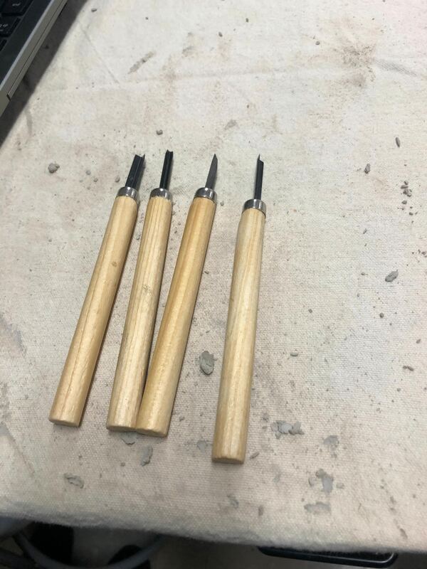
Using carving tools (shown in the first image), I carved out the sketches that I did in my sketchbook while I was planning onto two linoleum plates. I wanted to compare how the linoleum cuts looked with the geometric and organic shapes, and which design looked as if it would produce a cleaner print.
|
|
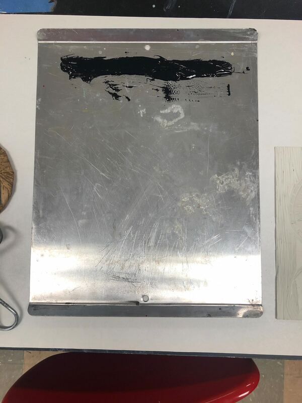
Using the plastic palette knife, I stirred and scooped the black water-based block printing ink onto the printing tray that I set on top of a newsprint paper (to avoid messes). I only put a couple smaller scoops onto the tray, as shown in the image to the left, near the top of the printing tray.
|
|
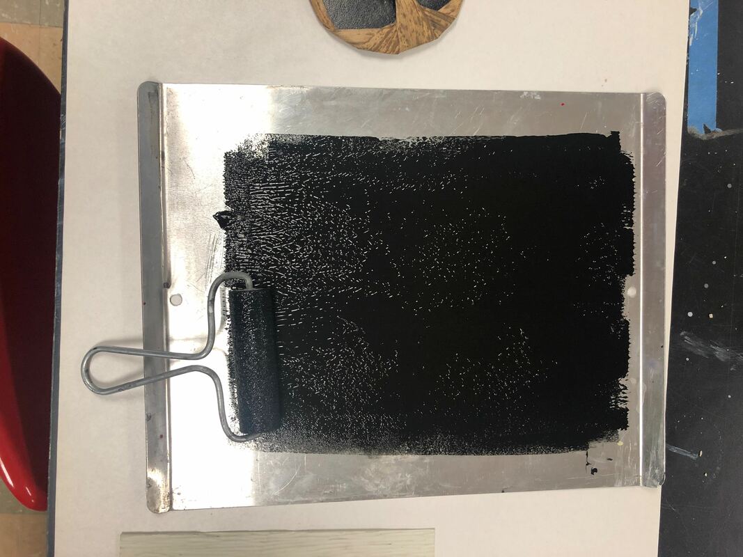
Then, I grabbed an ink brayer (like a roller) and started from the top of the tray where the block printing ink was and rolled the block printing ink in a line down the printing tray until it looked like a decent square of black with not too much ink standing at the surface, and still enough on the brayer itself..
|
|
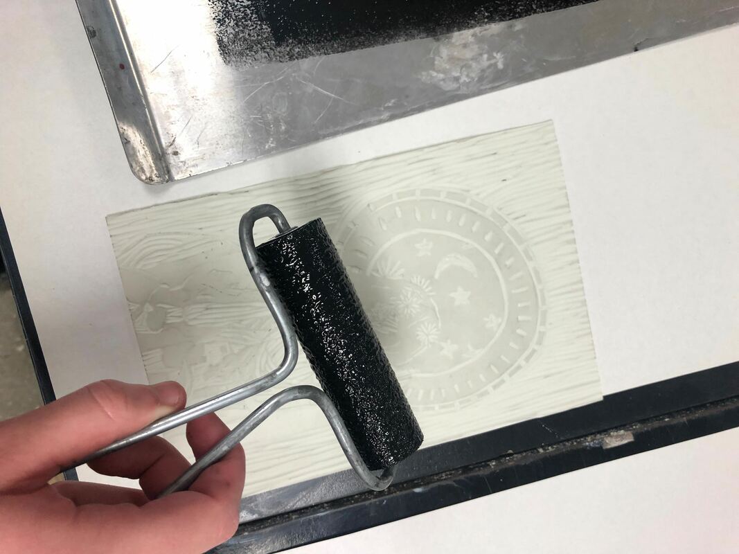
With the extra block printing ink on the ink brayer, I took the ink roller and rolled it on top of my linoleum cut on the side with the textures from the cuts I had made. I attempted to put more ink on the areas of the print that I envisioned to be darker and more of a bold black such as the part with the stars and moon.
|
|
I knew I was done rolling once there was enough ink to make a sufficient print, but not so much that the details in the piece were lost among the shapes in the pieces that I had imagined would be in the background instead. To the left is an example of one of the times I had inked the linoleum and tried to make different ares in the print have more or less ink than others.
|
|
|
The first image is a picture of a brayer rolling tool (left) and a bamboo printmaking baren (right). After I carely placed the drawing paper onto the top of the inked side of my linoleum plate, I used the baren to flatten the paper and push paper into the ink the ink. To use the baren, I applied the pressure evenly across the paper and rotated the baren across the paper in a circular fashion.
|
Reflection
Compare & Contrast
|
|
Critique
I like how the geometric and organic shapes in my piece reflect those of my inspiration, but If I were to redo this project, I would definitely make use of the negative space surrounding my figures and try to use it to add my little details there, or to stretch out the image so it is not so crowded when centered in the very middle of everything. I am surprised by how much I ended up liking the texture created by the background and felt that it gave it a bit of a woody, rustic feeling that I had not previously meant for it to have. If I were to do this project again, I would want to see what it would look like with more colors, or seeing how making a larger effort to completely smooth out certain cuts would impact the overall unity of the piece and if my piece would gain more of it afterwards. I did end up liking this method of printing a lot better than dry-point printmaking and will consider this type of printing for future projects that I do.
ACT
|
Clearly explain how you are able to identify the cause effect relationship between your inspiration and its effect on your artwork?
Mucha's use of geometric shapes versus his use of organic shapes inspired me to emphasize certain parts of my piece by using a difference in organic and geometric shapes in the background and foreground. What is the overall approach the author has regarding the topic of your inspiration? The writers of the article "Non Traditional Employment for Women:Expert Career Advice" take the approach that women require a greater representation in a male-dominated workforce and describes how woman may achieve those types of careers. What kind of generalizations and conclusions have you discovered about people, ideas, culture, etc. while you researched your inspiration? I have concluded that the rights and view of a "Perfect woman" have been around for hundreds, and even thousands of years in our societies and are a constantly evolving topic. What is the central idea or theme around your inspirational research?. The central theme around my research was how women last representation and that it it not a normalized thing for a woman to chose to do masculine things while still be a feminine figure in society. What kind of inferences did you make while reading your research? I made the inference that a lot of artists have used their own platforms to depict their own ideas of what a woman should be or look like depending on their own cultural influences. |
BibliographyNorman Rockwell Museum, www.nrm.org/MT/text/GirlMirror.html.
“Poster for 'Job' Cigarette Paper (1896).” Muchafoundation.org, www.muchafoundation.org/gallery/browse-works/object_type/posters/object/44. “Poster for 'Moët & Chandon: Dry Imperial' (1899).” Muchafoundation.org, www.muchafoundation.org/gallery/browse-works/object_type/posters/object/52. Writers, Staff. “Non Traditional Employment for Women: Expert Career Advice.” How to Become, LearnHowToBecome.org, 21 Dec. 2015, www.learnhowtobecome.org/underrepresented-careers-for-women/. |
