
Artwork: Choice Piece
|
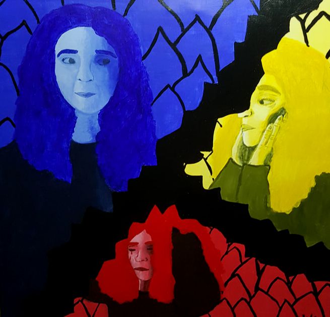
Title: Split
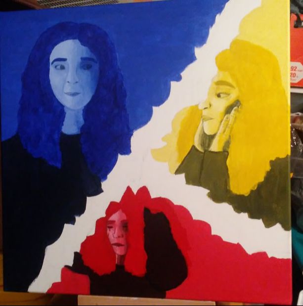
Size: 60.96 cm x 60.96 cm Medium: Acrylic paint on hand-stretched canvas Completion: April 17, 2019 Split is a an acrylic painting on hand-stretched canvas created to show the levels of anxiety and stress that teenagers, especially me, face on a daily basis from school or other aspects of life. This piece was inspired by Frida Kahlo's use of thorns and imagery in Self-Portrait with Thorn Necklace and Hummingbird, Piet Mondrian's use of dark line and bright color in Composition II in Red, Blue, and Yellow, and Andy Warhol's contrast of various colors in Marilyn Monroe series.
|
Inspiration
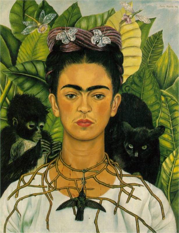
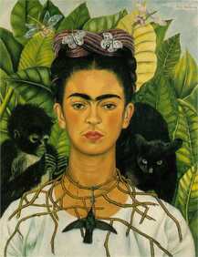
Kahlo, Frida. Self-Portrait with Thorn Necklace and Hummingbird, 1940. Oil on canvas. Fridakahlo.org.
|
In Frida's self-portrait, I wanted to use the aspect of the thorns versus the lack of emotion that she seemed to display. I also liked the contrast between the dead, painful thorns and the vibrant, living leaves in the background. Many of the symbolic themes in her paintings such as the animals and the thorns were used to express her own feelings rather than creating a realistic piece. I liked the freedom to focus on feeling rather than accuracy, so I wanted to use that in my own piece and abstract my original ideas for the piece into something with more feelings than realism involved, although I still wanted to include some aspect of realism in it.
|
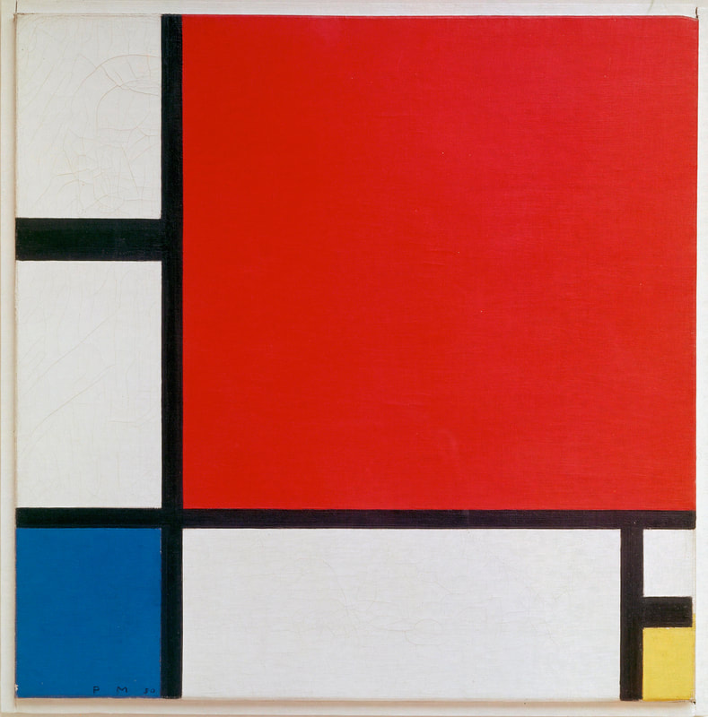
Mondrian, Piet. Composition II in Red, Blue, and Yellow, 1929. Oil on canvas. Kunsthaus Zürich.
|
In Piet Mondrian's works I liked the crispness of the dark black lines that separated the large blocks of color. This form of abstraction is a lot cleaner than the other forms that I have seen, which caught my eye. With my own piece I wanted to use the dark black lines to separate the various colors that I was including in my piece. Like Mondrian, I also wanted to make different areas of color various sizes to emphasize the impact of each of the colors used.
|

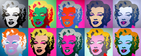
Warhol, Andy. Marilyn Monroe Series, 1962-1967. Screenprint prints. Masterworksfineart.com.
|
In the Marilyn Monroe pieces by Andy Warhol, I liked the repetition, but the part that I wanted to use the most was the emotion inflicted with the contrast between colors in each of the prints. I wanted to use the colors of Mondrian and the contrast of Warhol to create a large sense of emotion between the different areas of my piece.
|
Planning
|
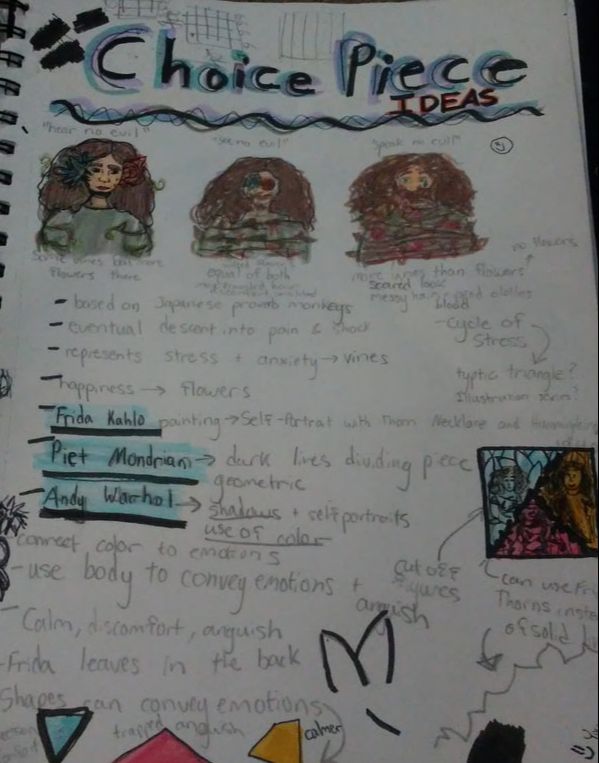
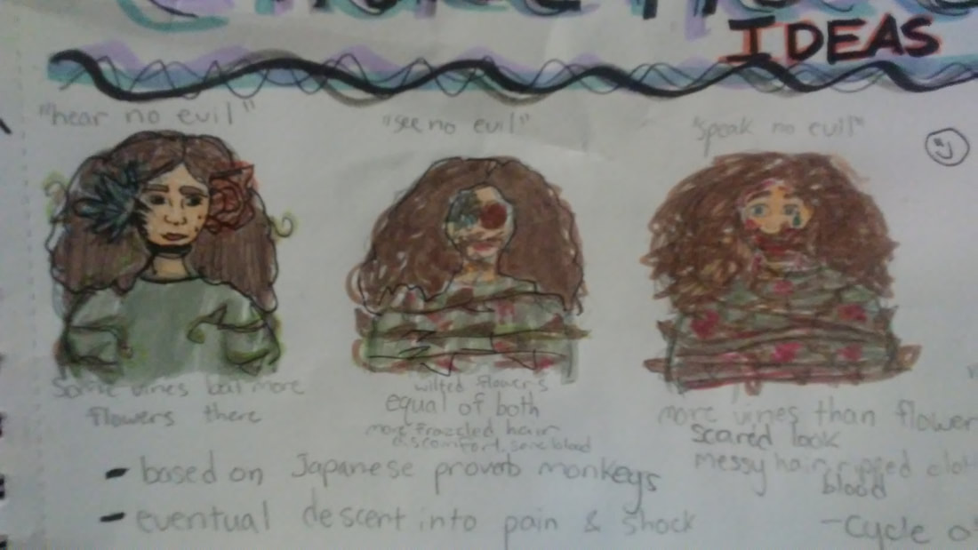
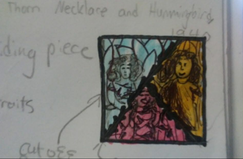
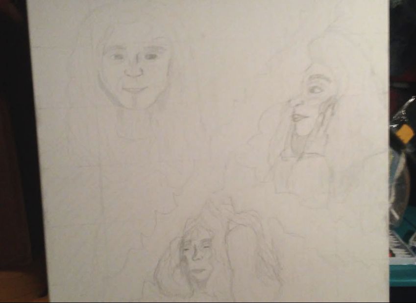
In my initial ideas (see top right), I wanted to use more of the thorns aspect to represent the evolution of stress within an individual. I wanted the first image to be carefree with little to no thorns, the second image to be semi-covered in thorns, and the final image to be very chaotic and filled with thorns.
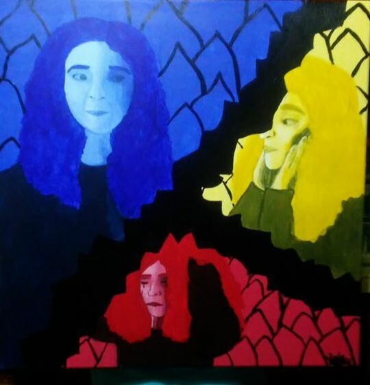
But, as I looked more at different inspiration pieces and discussed my ideas with other people, I lessened up on the idea of the thorns and decided to focus more on color like Warhol and Mondrian did in their pieces I looked at. This lead to me coming up my next sketch (see bottom right), and deciding to separate the colors that I used similarly to Mondrian. |
|
Experimentation
|
|
|
|
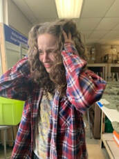
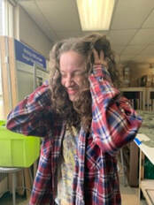
In my experimentation, I played with the different posing of facial and hand gestures to try and come up with a pose that would help instill strong emotions in the viewers. The first picture is where I tried a more calm, and almost content face, without the use of my hands. The second picture, I tried a sad, and distant feeling, looking towards to left to symbolize looking back into the past, and stressing about things that couldn't be controlled. Lastly, in the final two images, I played with different facial expressions to see what one would look more worried and give the sense of severe stress and anxiety.
|
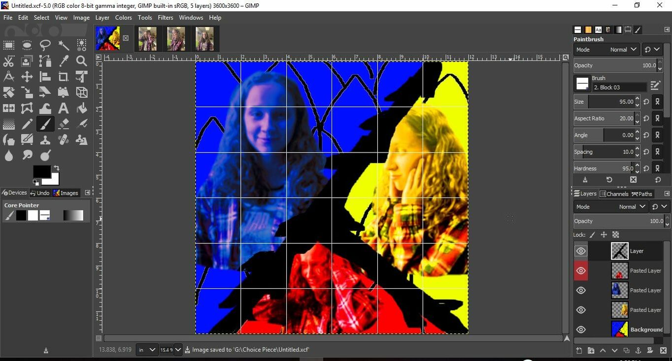
Next, I experimented with the various colors that I could use within my piece while creating a photo shopped image. In this, I messed with the colors to see where each shadow would go and where I needed to add contrast between different colors.
|
|
Process
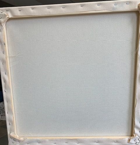
Stretching the Canvas
|
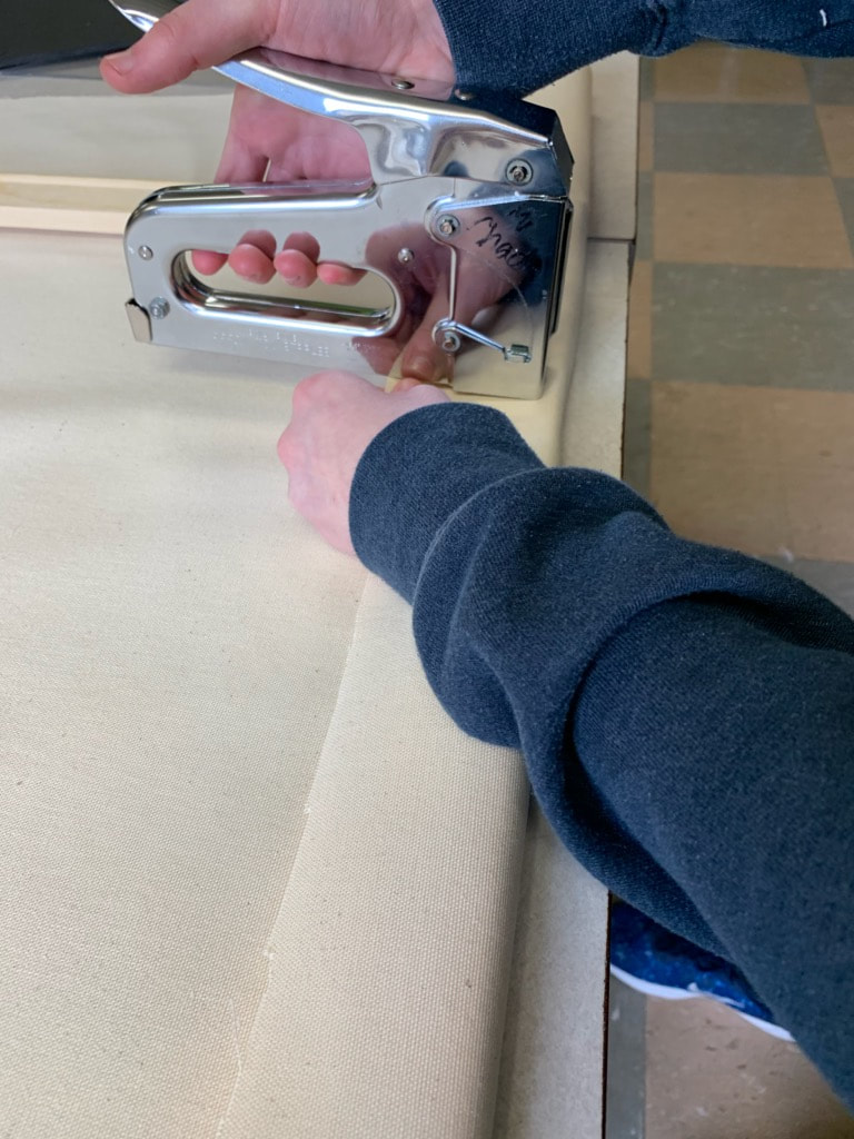
I took the 60.96 cm frames that were provided by my art teacher and put them together int the corners where they connect. I then used the carpenter's triangle and placed the side with the 90 degree angle in the corners of the frame pieces that were snapped together. If it was square, then I used the staple gun and put two staples over the part where the pieces snapped together If the staples were too loose, I took the hammer and gently hammered the staples in farther. Taking the first side, I pulled the canvas over the top of the frame and placed a staple through the canvas and onto the frame using the staple-gun.
|
|
I repeated this about 8 times or so on the first side. I repeated this step with the side across from the first side of the frame, pulling the canvas tight, but enough for the canvas to have a small bounce to it once touched. I them did this with the other two sides.
|
|
|
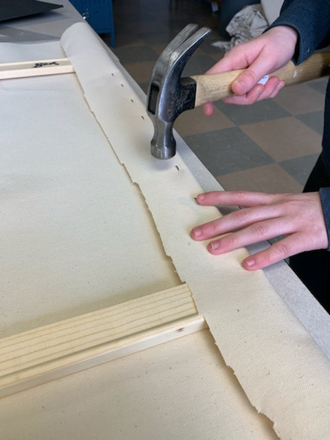
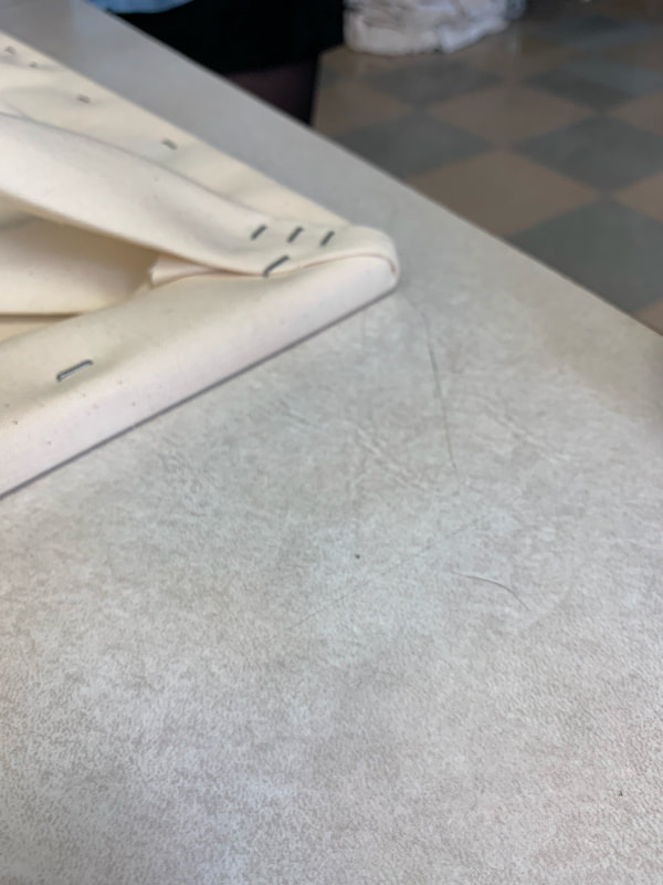
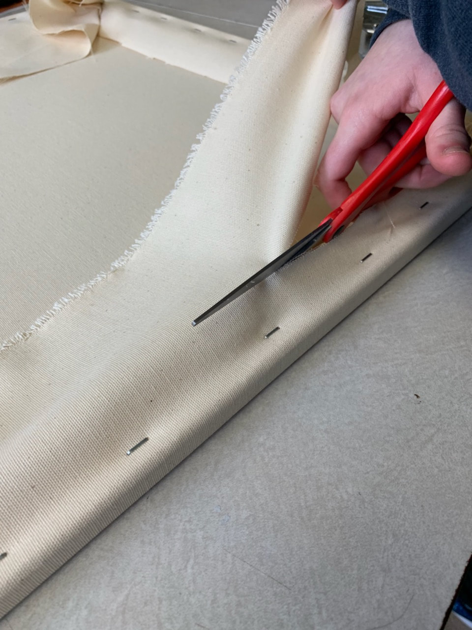
Then, I secured the corners of the piece by folding the canvas and stapling it down a couple times in order to make sure the corners were not visible from the other side . I hammered in any loose staples, and then took the scissors and cut off the excess canvas on the back of the canvas.
Then, I secured the corners of the piece by folding the canvas and stapling it down a couple times in order to make sure the corners were clean and sturdy. I hammered the staples that I put in to make sure they were more secure. |
|
Any loose strings were trimmed and once the canvas was secure, I began to gesso using acrylic white gesso. This process helped tighten up the canvas more than it was before, and I ended up doing two coats to cover the whole canvas.
|
Painting
|
|
Before I began painting I sketched a 6 inch by 6 inch grid and then used that grid to transfer my photo shopped piece onto the canvas. For the painting I used a size 1, size 8, and size 6 paintbrush.
|
|
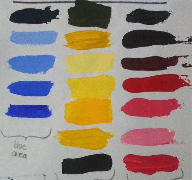
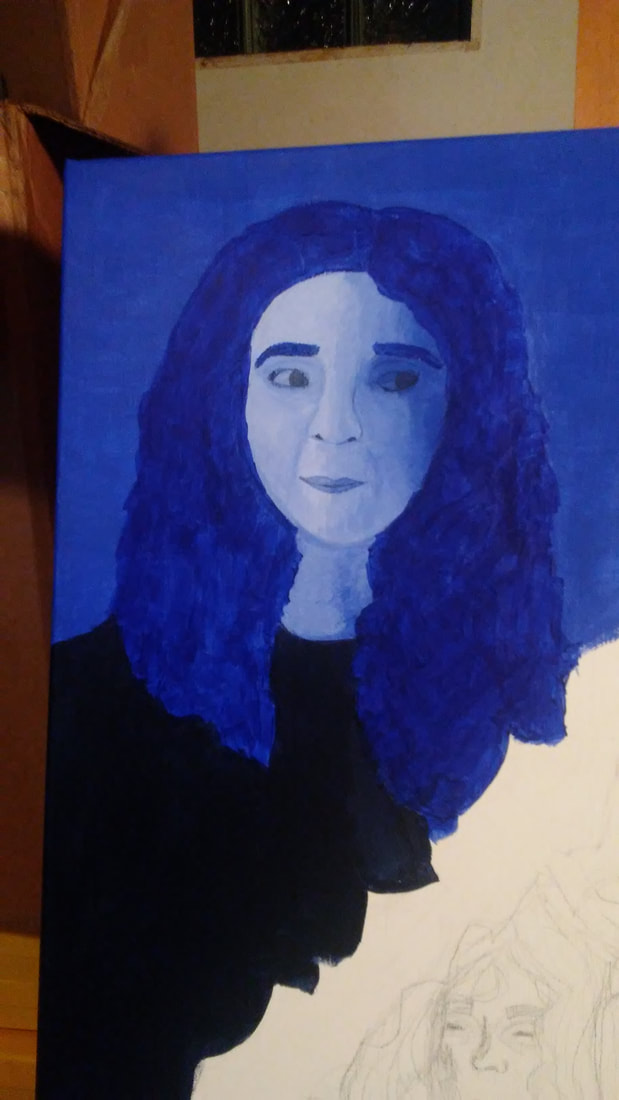
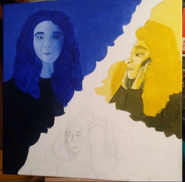
The first area I painted was the blue, calmer area. I chose the blue because it reminded me of a calming feeling and I wanted to use that feeling rather than the sad feeling that may be associated with the color. I used the standard ultramarine blue for the hair and eyebrows, a slightly lighter ultramarine blue mixed with titanium white. For the face, I used mixtures with more titanium white than ultramarine blue, and then the same blue from the backgrounds. For the shirt I used a mixture of mars black and the ultramarine blue.
|
|
|
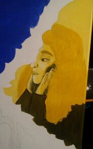
Similarly to the blue, I used the standard cadmium yellow medium hue,and for the face I used mixtures of titanium white and the cadmium yellow. For the shadows and the shirt, I used a mixture of the mars black paint and the cadmium yellow paint. I was very happy with the color schemes on this section.
|
|
|
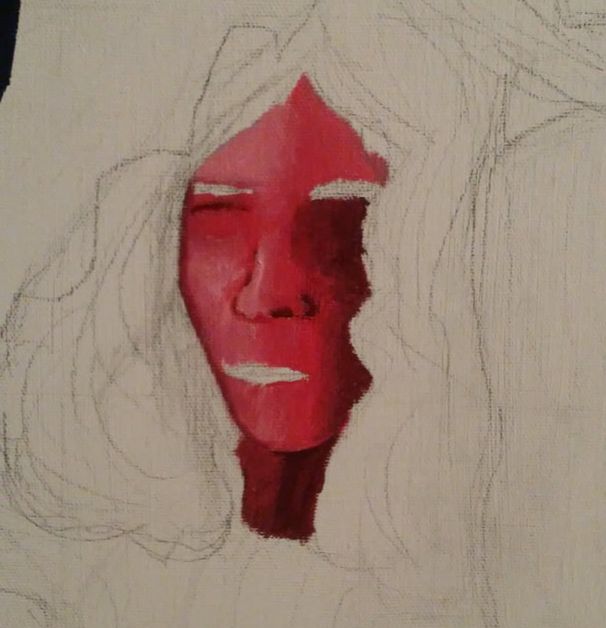
The red section was the smallest of the three so it took less time. For the face I used lighter hues of the cadmium red light hue and titanium white, for the hair I used just cadmium red light hue, and for the background I used cadmium red light hue and titanium white mixed together. For the shirt I used a mixture of mars black and the cadmium red light hue.
|
|
|
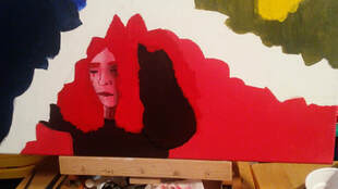
Using the mars black and the size six brush, I painted on the vines to separate the three different color areas that I painted previously. I also ended up adding leaves similarly to Frida Kahlo's self-portrait, but only made the outline of them to stick to the abstraction that I wanted to include.
|
Reflection
Compare & Contrast
|
CritiqueOverall, I really like how the blending of skin tones and the use of shadows versus light to create contrast in each section were done. But, If I were to redo this piece I would definitely try to expand each of the images in each section and play with the proportions to see if the proportions could odd or create new positive and negative space. Also, I would play with adding implied texture like in Frida's self-portrait. Out of all the sections, the area that I did with yellow tones was the best out of the sections because of the strong use of shadows versus light to create contrast.
|

ACT
|
Clearly explain how you are able to identify the cause effect relationship between your inspiration and its effect on your artwork?
The use of color to create contrast in Mondrian's and Warhol's pieces inspired me to play with the colors to instill emotion in the viewers with more than just the poses. What is the overall approach the author has regarding the topic of your inspiration? The writers for the article on Khan Academy had a very straightforward approach to Modrian's work and was meant more to educate on the overall reasoning behind his artwork during the time. What kind of generalizations and conclusions have you discovered about people, ideas, culture, etc. while you researched your inspiration? I concluded that no matter the culture, or societal impacts, the colors that we associate with emotions are normally similar, if not the same between different pieces of art around the world. What is the central idea or theme around your inspirational research?. The central theme in my inspirational research was finding a way to invoke emotions and help show to a great extent what those emotions impact in our daily lives as teens or even adults. What kind of inferences did you make while reading your research? I inferred that abstraction is not just with the line or shape but also with the use of color. Abstraction works very well in letting the viewers decide the impact the piece has on them. |
BibliographyAnalysis: Andy Warhol's Marilyn Monroe Series (1962, 1967), news.masterworksfineart.com/2017/10/10/andy-warhols-marilyn-monroe-series-1967.
“Composition II in Red, Blue, and Yellow, 1929.” Composition II in Red, Blue, and Yellow, 1929 by Piet Mondrian, www.piet-mondrian.org/composition-ii-in-red-blue-and-yellow.jsp#prettyPhoto. “Harry Ransom CenterThe University of Texas at Austin.” Harry Ransom Center, www.hrc.utexas.edu/exhibitions/2011/kahlo/. “Mondrian, Composition with Red, Blue, and Yellow.” Khan Academy, Khan Academy, www.khanacademy.org/humanities/ap-art-history/later-europe-and-americas/modernity-ap/a/mondrian-composition. “Self-Portrait with Thorn Necklace and Hummingbird, 1940.” Henri Matisse, www.fridakahlo.org/self-portrait-with-thorn-necklace-and-hummingbird.jsp. |
