
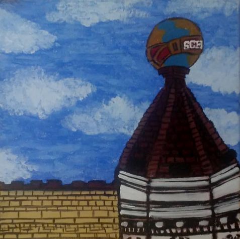
Artwork: Project One

|
|

|
Title: Three Brothers (series)
Size: 30.84 cm x 30.84 cm
Medium: Acrylic paint on hand-stretched canvas
Completion: September 9th, 2019
Size: 30.84 cm x 30.84 cm
Medium: Acrylic paint on hand-stretched canvas
Completion: September 9th, 2019
Three Brothers is a an acrylic painting series on hand-stretched canvases created based on the restaurant Three Brothers in Milwaukee. This piece was inspired by Édouard Manet's Bar at the Folies-Bergère and the placement of the woman and bottles, and Vincent Van Gogh's Exterior of a Restaurant at Asnieres. The restaurant series is meant to showcase a place that means a lot to me and has given me a lot of new opportunities in life.
Inspiration
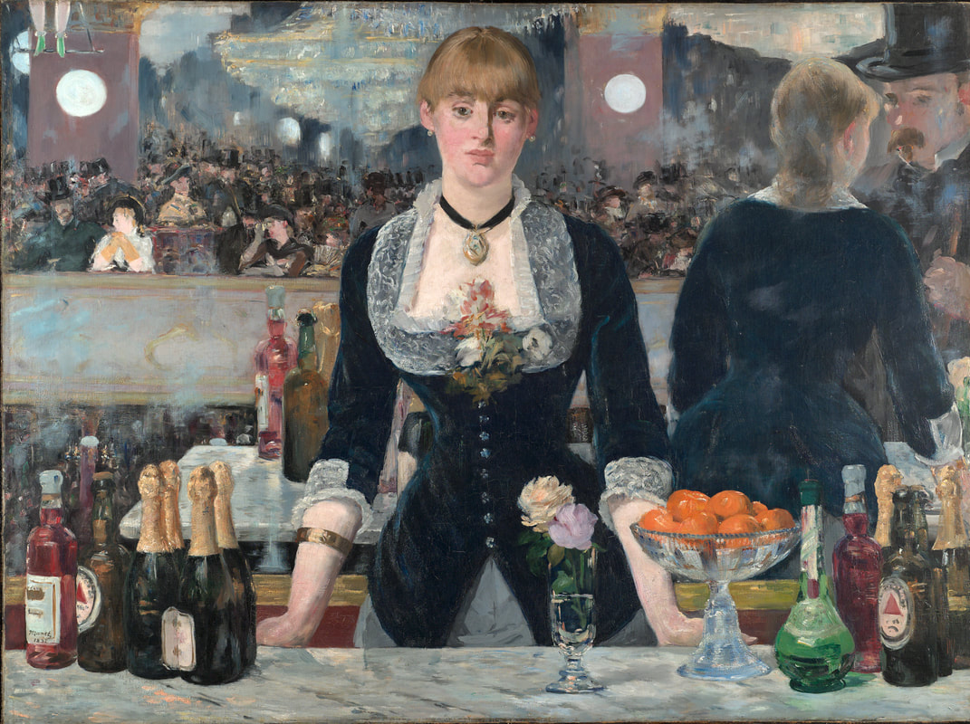
Manet, Édouard. Bar at the Folies-Bergère, 1882. Oil on canvas. The Courtauld Gallery, London.
|
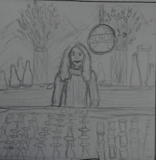
Bar at the Folies-Bergère was Manet's last major work and featured a place that he knew fairly well. I wanted to use this sense of familiarity as well as his placement of the woman in front of the bar with the bottles. The scene reminded me of one of the pictures that I took of the restaurant that I work at so I was inspired to create a piece about it since they have taught me a lot there. The bottles and glasses with the brushstrokes intrigued me and was one of the things that made me want to use this painting as an inspiration for my piece.
|
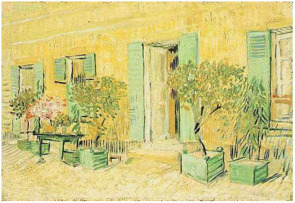
Van Gogh, Vincent. Exterior of a Restaurant at Asnieres, 1887. Oil on canvas. Van Gogh Museum.
|
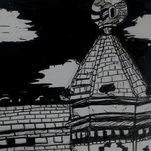
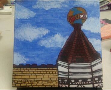
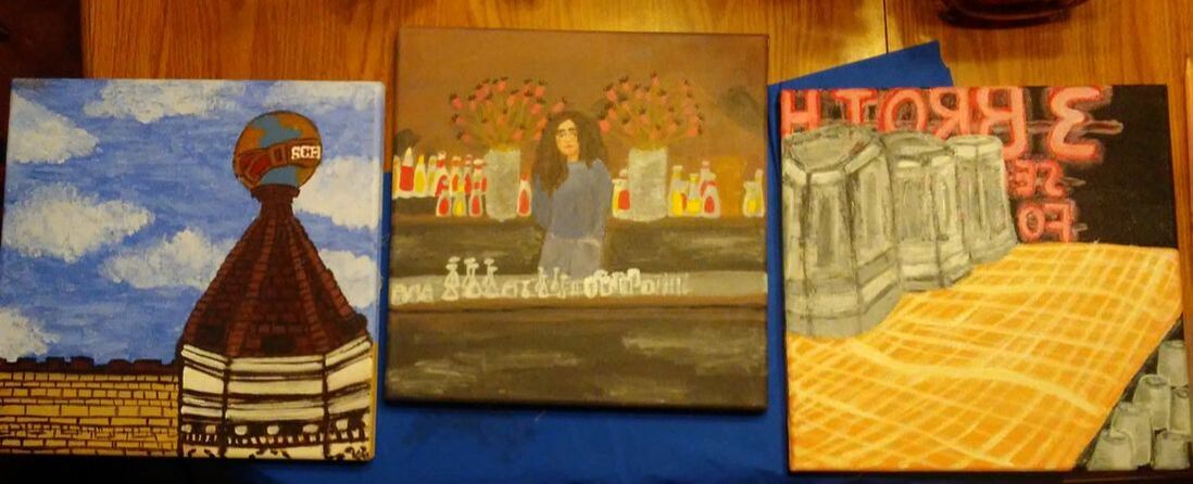
Exterior of a Restaurant at Asnieres is a painting by Van Gogh. I have always liked the brush strokes and implied movement that the impressionist movement has, so once I found this painting, I wanted to use it as a inspiration. I decided to paint the outside of my restaurant I work at because of the globe on top of the building and how iconic it is. The brief brush-strokes and warm feeling is something that I wanted to include in my own piece. I wanted to convey the happy memories that I have had so far at the restaurant and allow the viewers to feel the same emotions that I have.
|
Planning
|
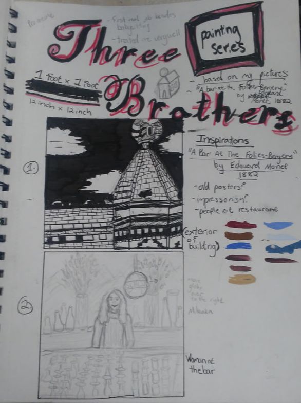
Originally I planned to make four paintings , but then I decided to make three paintings instead because of the symbolism behind the three in the name of the restaurant as part of the story of how the restaurant was created.
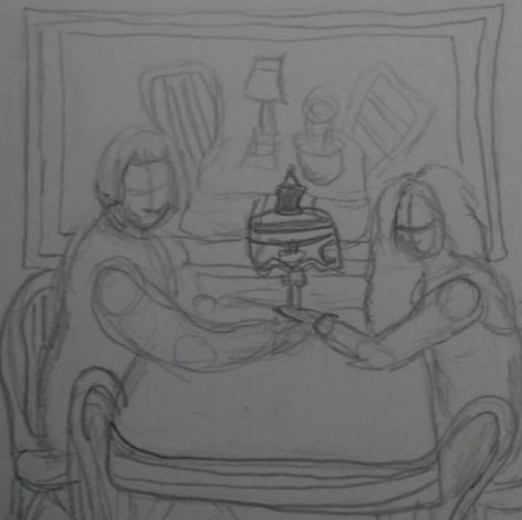
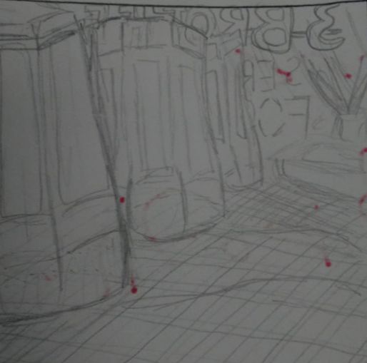
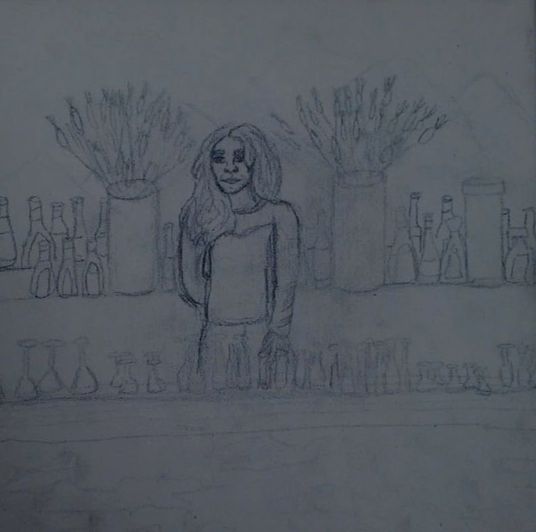
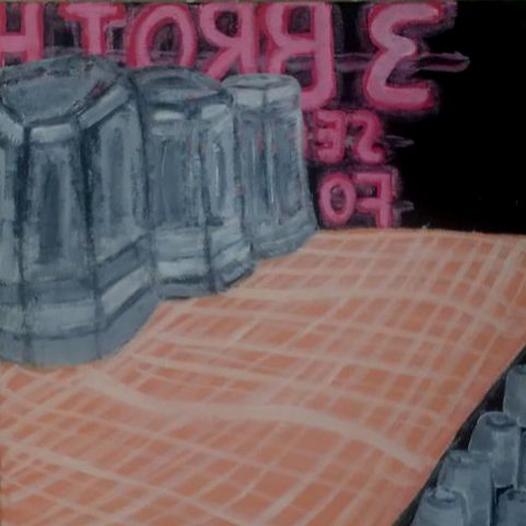
To the left is the whole first sketch page that I had created with all of my ideas about the restaurant and the topics that i wanted to address within the piece. The sketch to the bottom left is one that I decided to scrap for number sake, and because I wanted to focus on the place itself rather than including more paintings of the people. To the top right is my first sketch, the outside of the restaurant. I thought that based on the reactions of people I know and people that come into, the outside was iconic. I also found Van Gogh's painting and thought that the outside of a restaurant is still filled with as many memories as the inside. The second sketch to the right is based on the Bar at the Folies-Bergère, and I wanted to use this painting to show the people aspect of the restaurant. My bosses and coworkers take care of me as if I am part of their family so I wanted to focus a part of the piece on them. The sketch to the bottom right is a close up of the glasses and neon sign from my point of view while I'm in the restaurant because I wanted to show more of my emotions in this part than the rest. While it may not have a specific emotions labelled, I still wanted to show the perspective that I have while I am working. |
|
Experimentation
|
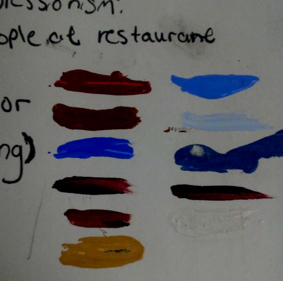
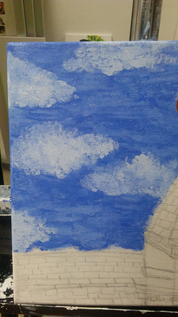
Most of my experimentation was based on the colors that I used. I didn't want to rely on colors for emotions, but I still wanted to capture the colors of the restaurant. To the left is an image of an example of the paint swathes that I took while painting the first piece. I used mainly brighter colors for the sky and was going to make the building lighter as well, but decided to make it the darker browns instead in order to create more of a contrast than there would be with the lighter browns.
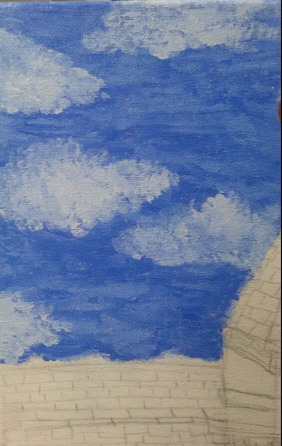
The clouds also took a bit of work with layering. I wanted them to be light and fluffy but still prominent to feel secure and add to the scene. I started painting the sky with impressionism styles like Van Gogh, but the rest of the painting I decided to use smoother, blended brush strokes and more solid colors. |
|
Process
Stretching the canvas
|
|
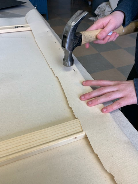
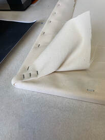
I took the 30.84 cm frames that were provided by my art teacher and put them together int the corners where they connect. Then I used the staple gun and put two staples over the part where the pieces snapped together If the staples were too loose, I took the hammer and gently hammered the staples in farther. Taking the first side, I pulled the canvas over the top of the frame and placed a staple through the canvas and onto the frame using the staple-gun.
|
|
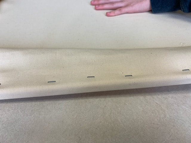
Then, I secured the corners of the piece by folding the canvas and stapling it down a couple times in order to make sure the corners were not visible from the other side . I hammered in any loose staples, and then took the scissors and cut off the excess canvas on the back of the canvas. Any loose strings were trimmed and once the canvas was secure, I began to gesso using acrylic white gesso. This process helped tighten up the canvas more than it was before, and I ended up doing two coats to cover the whole canvas. I repeated this process for the next two canvases as well.
|
|
|
Painting
|
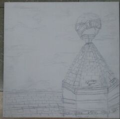
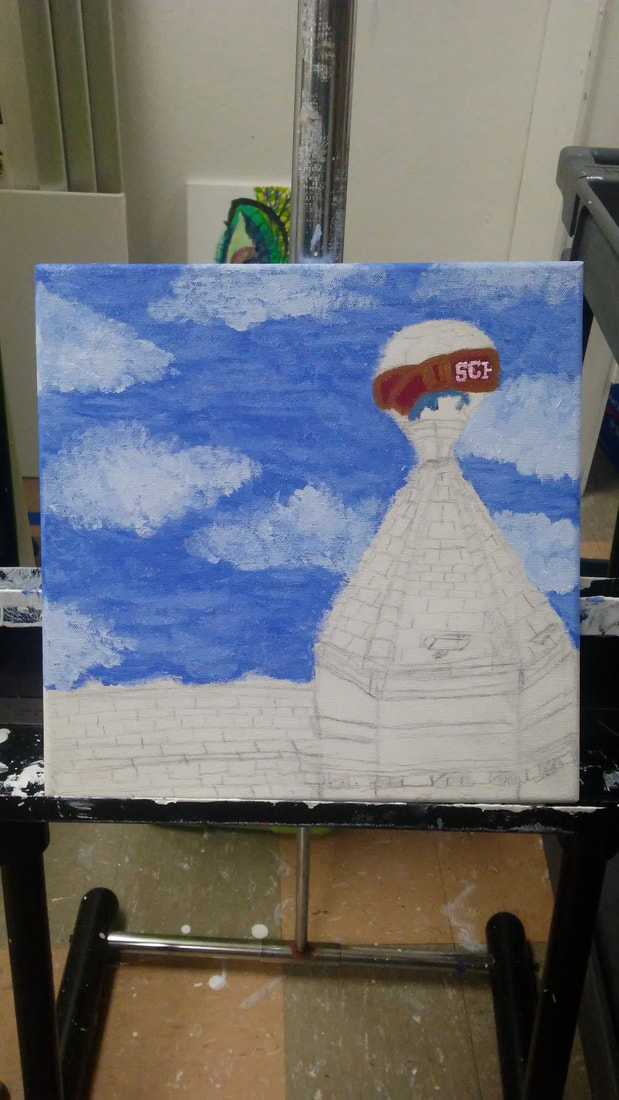
I started the paintings by sketching out my final sketches on the canvas with pencil. I did this free-hand with a reference photo instead of using the grid or transfer method like I usually do.
The paints that I used for this piece are Grumbacher Academy Acrylic paints in the colors titanium white, cadmium red light hue, cadmium yellow medium hue, ultramarine blue, and mars black. |
|
|
When I began to paint, I started by doing the sky. I mixed ultramarine blue and titanium white in various hues and used them in an impressionist style with short, rough brushstrokes. This part of the painting took me the longest because I wanted to be sure that I stuck to that style of impressionism while still making it a bit more of a realist painting. For the Schlitz logo on the globe, I mixed cadmium red light hue, cadmium yellow medium hue, ultramarine blue, and titanium white.
|
|
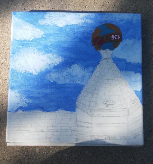
After I painted the logo on the globe, I painted the rest of the globe. I mixed up ultramarine blue, titanium white, and a little bit of yellow medium hue to make the blue part of the globe. For the yellow-green part of the globe I mixed ultramarine blue, yellow medium hue, and a little bit of titanium white.
|
|
Once the globe was finished, I mixed up yellow medium hue, ultramarine blue, mars black, and cadmium red light hue for the darker brown areas of the painting and for the lighter brown I took the darker born that I mixed up and added more yellow medium hue and titanium white.
For the almost white portion of the building I mixed up titanium white and a very little amount of the darker brown that I mixed up before to make it a grayish, brown. |
|
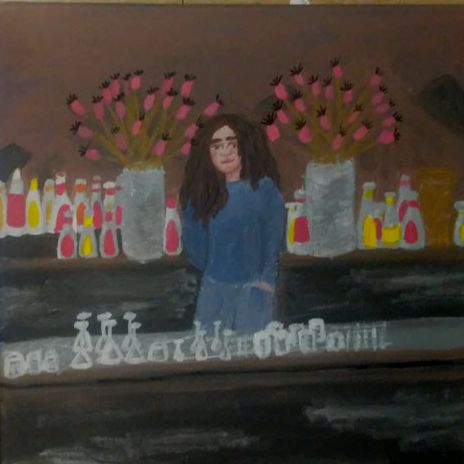
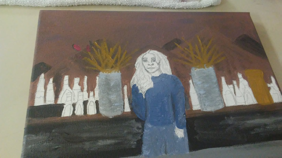
For the second painting, I also free-handed the initial sketch onto the canvas. I didn't like the face shape and placement of certain parts of the painting but I decided to just fix it once I started painting that part of the painting since you wouldn't be able to see the sketch once the paint was layered on top of it.
|
|
When I began painting, I started by painting the background behind the counter with the mountain scene. For the browns of the mountains and background I mixed titanium white, cadmium red light hue, cadmium yellow medium hue, ultramarine blue, and very little mars black for the darker browns.
For the plants and gold-looking container I used cadmium yellow medium hue, and a small amount of ultramarine blue. For the outfit I mixed ultramarine blue and titanium white. |

|
Then I painted the girl and the details on the bottles, glasses and plants.
For the girl I used the browns and gold that I had mixed up already for her hair. For her skin tone I mixed cadmium red light hue, ultramarine blue, cadmium yellow medium hue, and titanium white.For the glasses I mixed titanium white with a very small amount of mars black. |
|
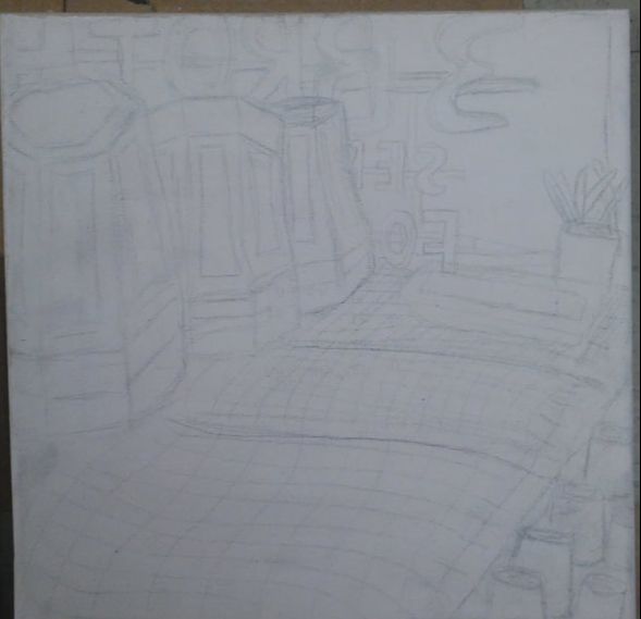
Lastly, for the third painting, I also free-handed the sketch on the canvas based on what I had sketched in my sketchbook.
|
|
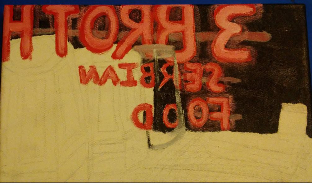
Then, I started painting the background with straight-up mars black and the neon sign with shades of red and pink that I mixed up with cadmium red light hue and titanium white.
|
|
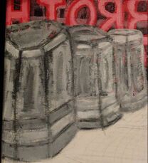
Nest I painted the larger glasses that were closer to the sign The painting of the glass was hard and took quite a bit of trial and error to get them to look decent in my standards.
|
|
To finish the third painting, I mixed cadmium red light hue, cadmium yellow medium hue, and titanium white to create the plastic and the counter underneath the glasses. To the left is an image of all three paintings once I had completed them all.
|
Reflection
Compare & Contrast
|
CritiqueIf I were to redo this painting, I would definitely try to do more of the paintings in the impressionist style in order to increase the overall unity of the three pieces together, or at least limit my palette to a few select colors. For the last two paintings I would also redo the glasses and bottles because I feel like I could still make them look at least a little bit more realistic than they turned out. I want to practice glasses more so that I can redo these paintings eventually. But, overall I enjoyed making this series because of the emotional connection I had to the theme that I was trying to convey.
|

ACT
|
Clearly explain how you are able to identify the cause effect relationship between your inspiration and its effect on your artwork?
My inspiration was initially Manet's piece, which reminded my of the restaurant that I work at. It reminded me of the restaurant so much that it was initially my main inspiration that I wanted to make a piece about. What is the overall approach the author has regarding the topic of your inspiration? The author has a generic approach, just describing the artwork and the meanings behind the creation of the piece. What kind of generalizations and conclusions have you discovered about people, ideas, culture, etc. while you researched your inspiration? The generalization that I made is that we as humans will be drawn to create art about places and things that we have an emotional connection to and good memories with. What is the central idea or theme around your inspirational research?. The central idea of my research was restaurants and places that artists painted that they had a connection to because I wanted to put an emotional aspect into my piece. What kind of inferences did you make while reading your research? Inferences I made were that artists will take places and people in their lives as inspiration for most of their pieces. |
Bibliography“Édouard Manet, A Bar at the Folies-Bergère.” The Courtauld Institute of Art, https://courtauld.ac.uk/gallery/collection/impressionism-post-impressionism/edouard-manet-a-bar-at-the-folies-bergere.
“Vincent Van Gogh Exterior of a Restaurant at Asnieres.” The Van Gogh Gallery, https://www.vangoghgallery.com/catalog/Painting/118/Exterior-of-a-Restaurant-at-Asnieres.html. |
