
Artwork: Project Three
|
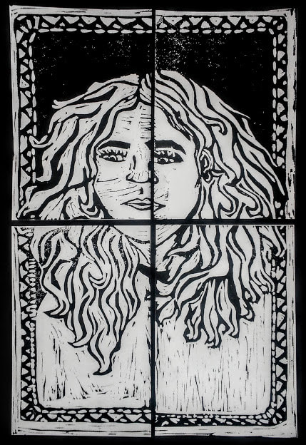
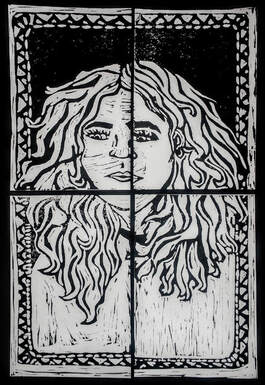
Title: "All 4 One"
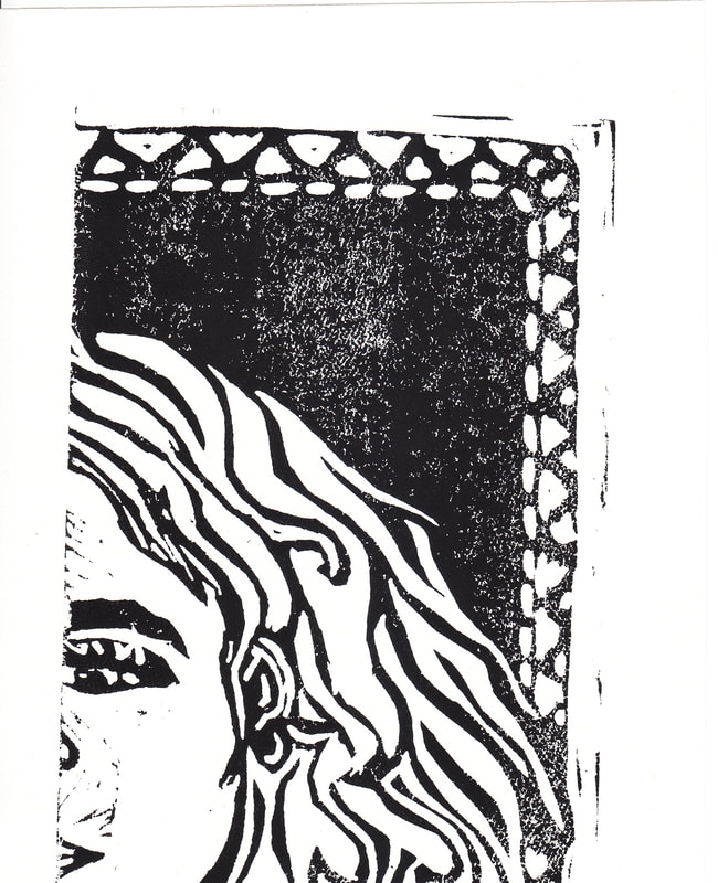
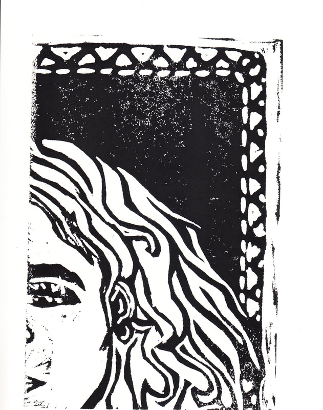
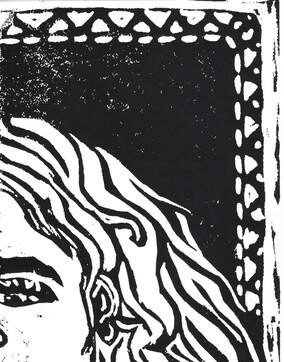
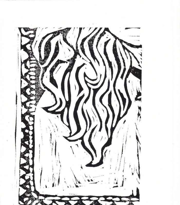
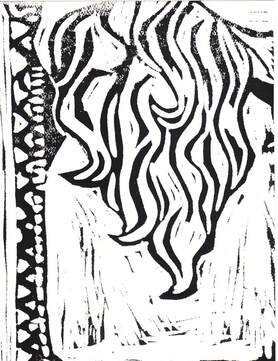
Size: 32 cm x 48 cm Medium: Block Print on drawing paper Completion: 10/17/19 "All 4 One" is a block print on drawing paper made using water-based block printing ink. This piece was inspired by the hair and designs in Alphonse Mucha's piece Job, and the strong emotions in The People by Käthe Kollwitz. "All 4 One" represents the sense of identity and wildness that can come from my hair and show a final relief in coming to terms with how my hair looks recently.
|
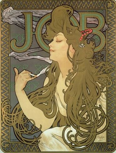
Inspiration
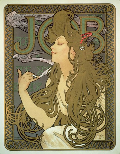
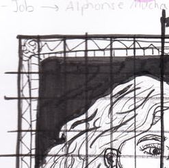
Mucha, Alphonse. Job, 1896. Color lithograph. Muchafoundation.org
|
For my block print series I wanted to focus on my hair and the impact that it has had on my life. One artist I thought accentuated the idea of free-flowing hair in their pieces was Alphonse Mucha. I loved the fluidity and movement in his pieces and wanted to have movement in my hair versus the static background. Mucha's use of women in his pieces conveyed a cultural aspect, which I wasn't leaning towards, except for the patter use surrounding the movement of the woman.
I also was inspired by the portraits that Käthe Kollwitz created using the woodcut method, like The People. The emotion and contrast that she puts in her pieces to address serious issues that she has experienced what I liked the most in her work. While me coming to terms with who I am and learning to love my hair is not quite the same cultural impacts as the issues she dealt with, I wanted an aspect of contrast and seriousness in my piece as well. |
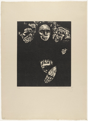
Kollwitz, Käthe. The People, 1922. Woodcut. MoMA.
|
Planning
|
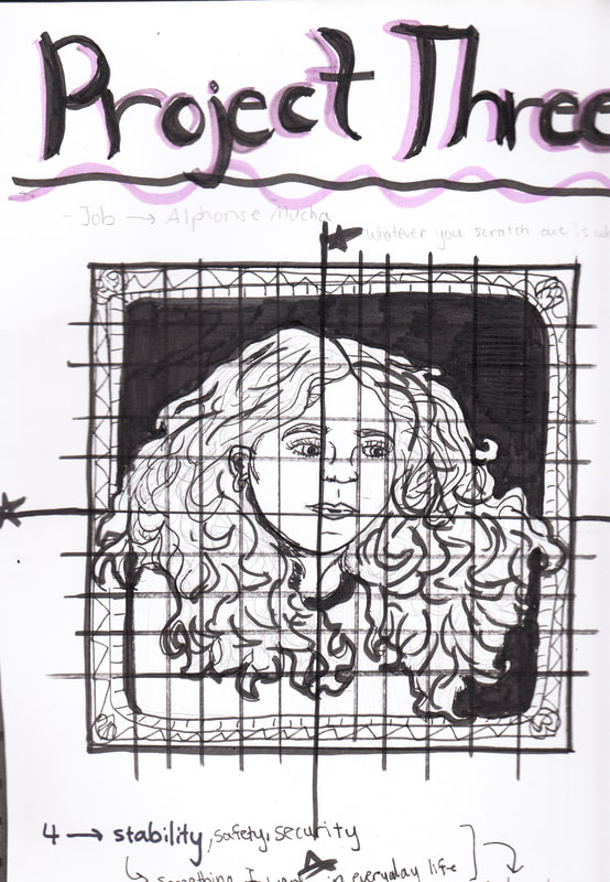
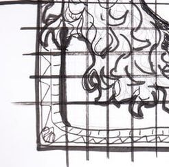
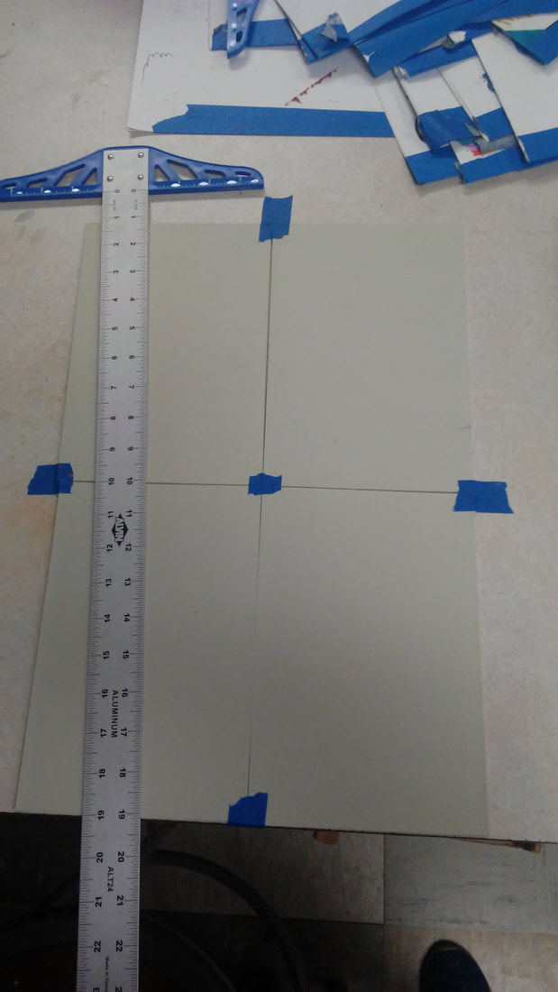
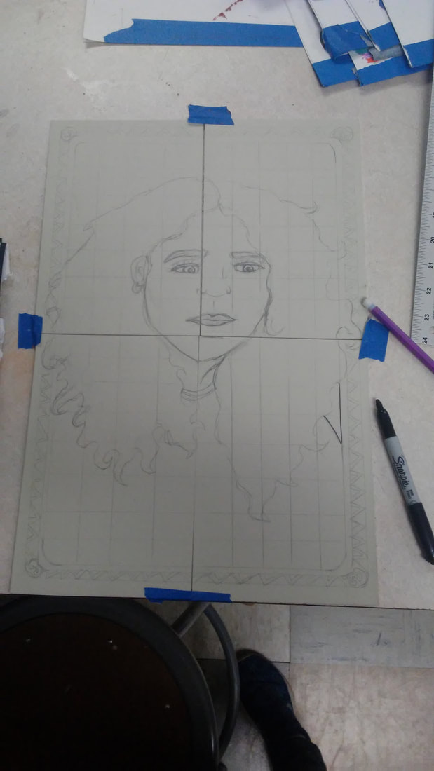
For the block prints I tried to create a sense of movement in my hair, while maintaining a level of contrast within my piece. I wanted to depict the wildness of my hair and the freedom that comes along with the wildness as well. I also decided to split the image into four different pieces and prints to represent stability and the security with my own image that I have been trying to find up till recently. The final piece would still have small spaces between the pieces to represent how I am still searching for that stability and security as I figure out how to care for and love my hair as it is even though I am almost an adult. To the left is a full image of the sketches of the four panels once they are put together to form one piece, along with some of my ideas about inspirations and meaning behind the number of panels. To the right is a close up of each of the individual sketches of the panels.
|
|
|
Experimentation
|
|
|
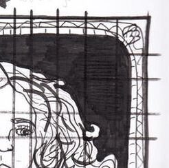
The first panel took me a couple prints in order to figure out the amount of ink and pressure that I needed to apply in order to make it turn out consistent and the way I wanted it to. The first print above needed more ink on specific spots and more pressure applied on places like the eyebrows. The second print was a lot better, but still needed some more ink. The last print is the one that I ended up going with because of the consistency compared to the other two.
|
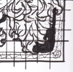
For the third panel I also had to do a couple prints in order to get a good consistency in the ink. To the left is the first print that I had for the third panel. It was good but I wanted the ink on the hair and the background to be a little darker like the first two panels to maintain the sense of unity. To the right is the print that I decided to go with because of the stronger contrast within in.
|
|
Process
|
|
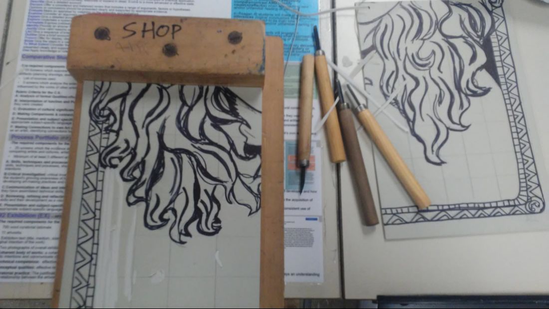
To start, I used the grid method to transfer the image I drew in my sketchbook to the linoleum plates. I taped the pieces down to know how the piece would look like with all the segments and to ensure that the lines all matched up together and didn't mess with the proportions that I wanted to have on the piece. after, I used a Sharpie marker to outline and color in the parts that I didn't want to carve out.
|
|
Then, I placed each of the plates onto a cutting block and used the block print cutting tools to cut out any of the areas on my drawing without the black lines on it. The movement of the hair was the hardest part of the carving process.
|
|
|
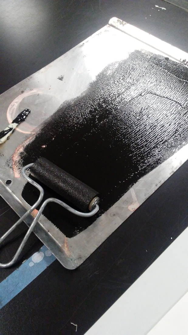
Using the plastic palette knife, I stirred and scooped the black water-based block printing ink onto the printing tray that I set on top of a newsprint paper (to avoid messes). I only put a couple smaller scoops onto the tray, as shown in the image to the left, near the top of the printing tray.hen, I grabbed an ink brayer (like a roller) and started from the top of the tray where the block printing ink was and rolled the block printing ink in a line down the printing tray until it looked like a decent square of black with not too much ink standing at the surface, and still enough on the brayer. I then rolled the ink from the brayer onto the linoleum plate till it was completely covered.
|
|

|
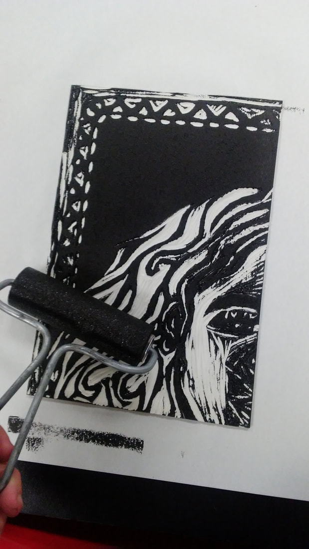
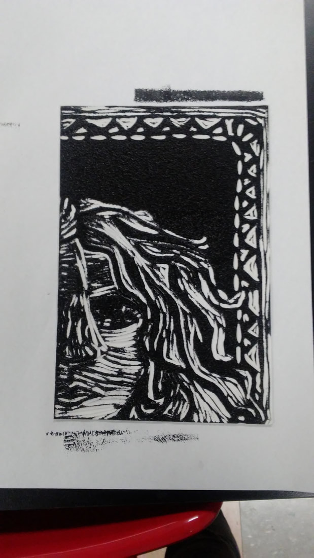
I then placed a paper on top of the linoleum plate. Using a bamboo printmaking baren I applied pressure to the top of the paper in a circular fashion. I repeated this process with the next three linoleum plate in order to get all four of the prints that I needed for my final piece.
|
Reflection
Compare & Contrast
|
CritiqueSo far, this is one of my favorite pieces that I have done so far. At first I was hesitant about the meaning and turning a struggle of mine into a calm piece, but as I made it, I liked how it turned out. If I redid the piece, I would definitely try to smooth out the lines on the first print of the series on the face to make it match more with the other side of the face. I would also add more movement within the body instead of keeping it static, or create a larger contrast by adding more black to the piece and not cutting out as much on the piece as well.
|

ACT
|
Clearly explain how you are able to identify the cause effect relationship between your inspiration and its effect on your artwork?
The movement and contrast within the two pieces of inspiration that I found are prevalent in my piece. What is the overall approach the author has regarding the topic of your inspiration? The author has a generic approach to the topic of my inspiration and focuses more on the elements of the piece and why it was created, rather than the piece and their feelings towards it. What kind of generalizations and conclusions have you discovered about people, ideas, culture, etc. while you researched your inspiration? Generalizations I have made about people is that they will pick issues that are important to them and create art about it to express their opinions on it as well. What is the central idea or theme around your inspirational research?. The central idea of my research is identity and coming to terms with who we are as people rather than the ideals that society places on us. What kind of inferences did you make while reading your research? I inferred that I am not the only one who is struggling with identity issues in their lives, especially during their teenage years. |
Bibliography“Käthe Kollwitz. The People (Das Volk) (Plate 7) from War (Krieg). (1922, Published 1923).” MoMA.org, https://www.moma.org/s/ge/collection_ge/objbyartist/objbyartist_artid-3201_tech-5_role-1_sov_page-9.html.
Mucha Foundation. “Poster for 'Job' Cigarette Paper (1896).” Mucha Foundation, http://www.muchafoundation.org/gallery/browse-works/object/44. |
